Carlos Romo-Melgar
→ Works
→ → Data Justice and COVID-19:
Global Perspectives
↓ JUMP TO CASE STUDY
1 General Information
1 General Information
1 General Information
1 General Information
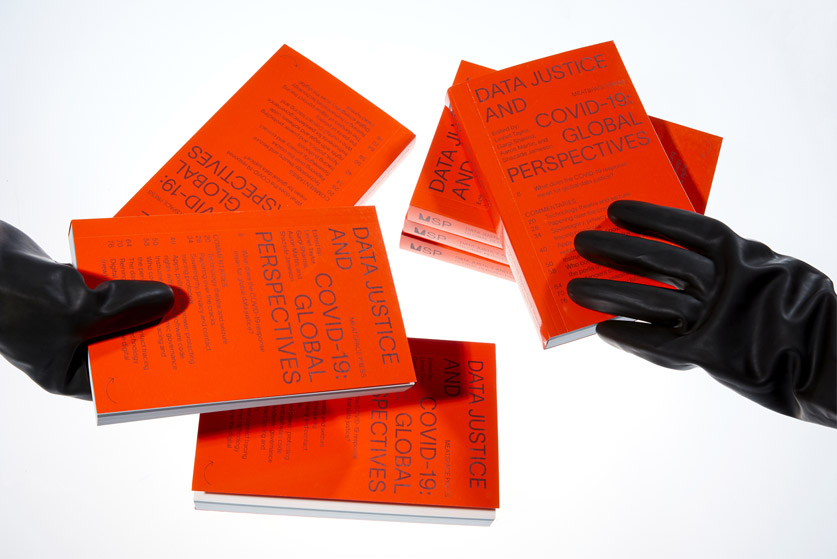
CLIENT: Meatspace Press
ROLE: Graphic Designer in collaboration with John Philip Sage
LOCATION: London
DATE: 2020
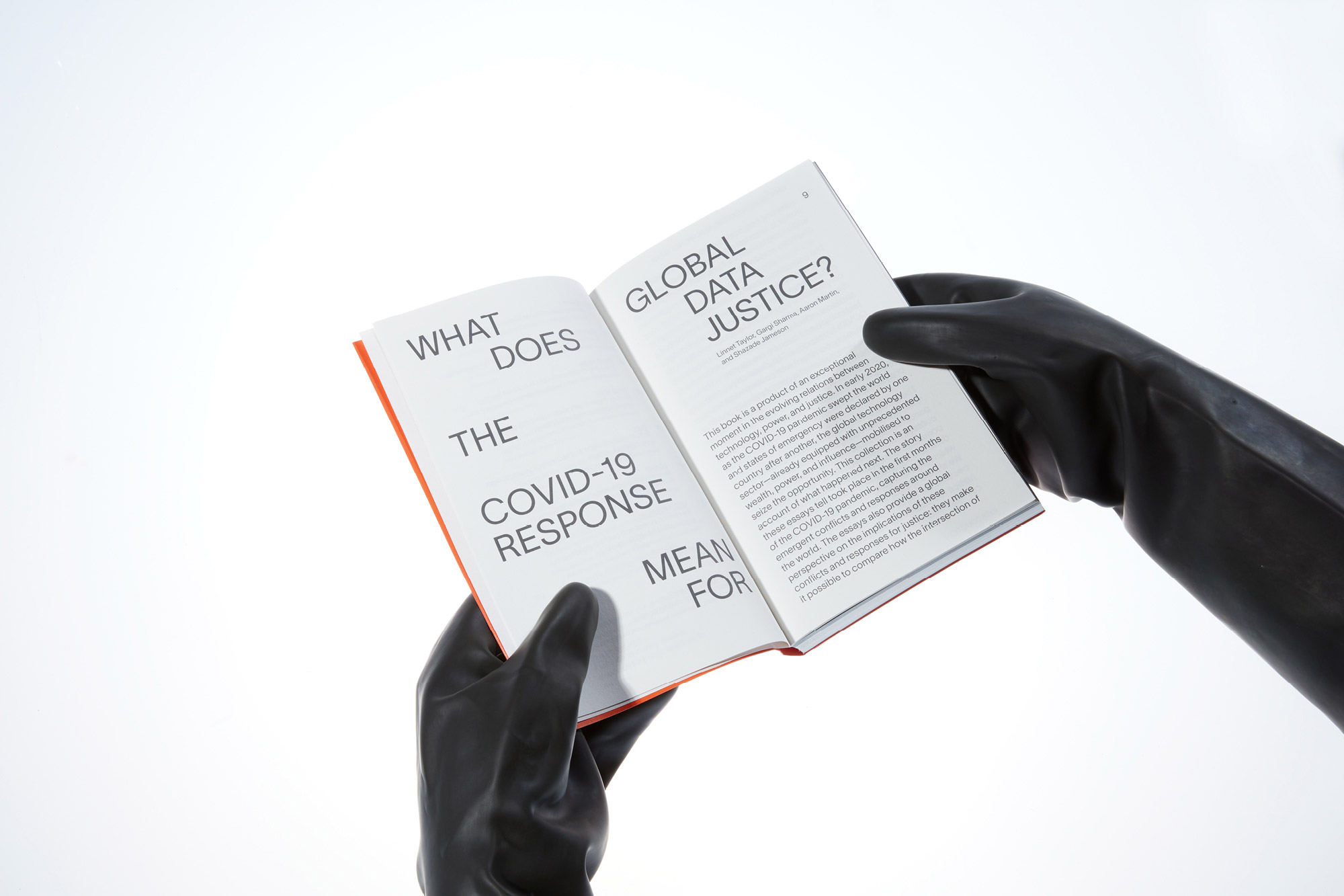
The COVID-19 pandemic has reshaped how social, economic, and political power is created, exerted, and extended through technology. Through case studies from around the world, this book analyses the ways in which technologies of monitoring infections, information, and behaviour have been applied and justified during the emergency, what their side-effects have been, and what kinds of resistance they have met.
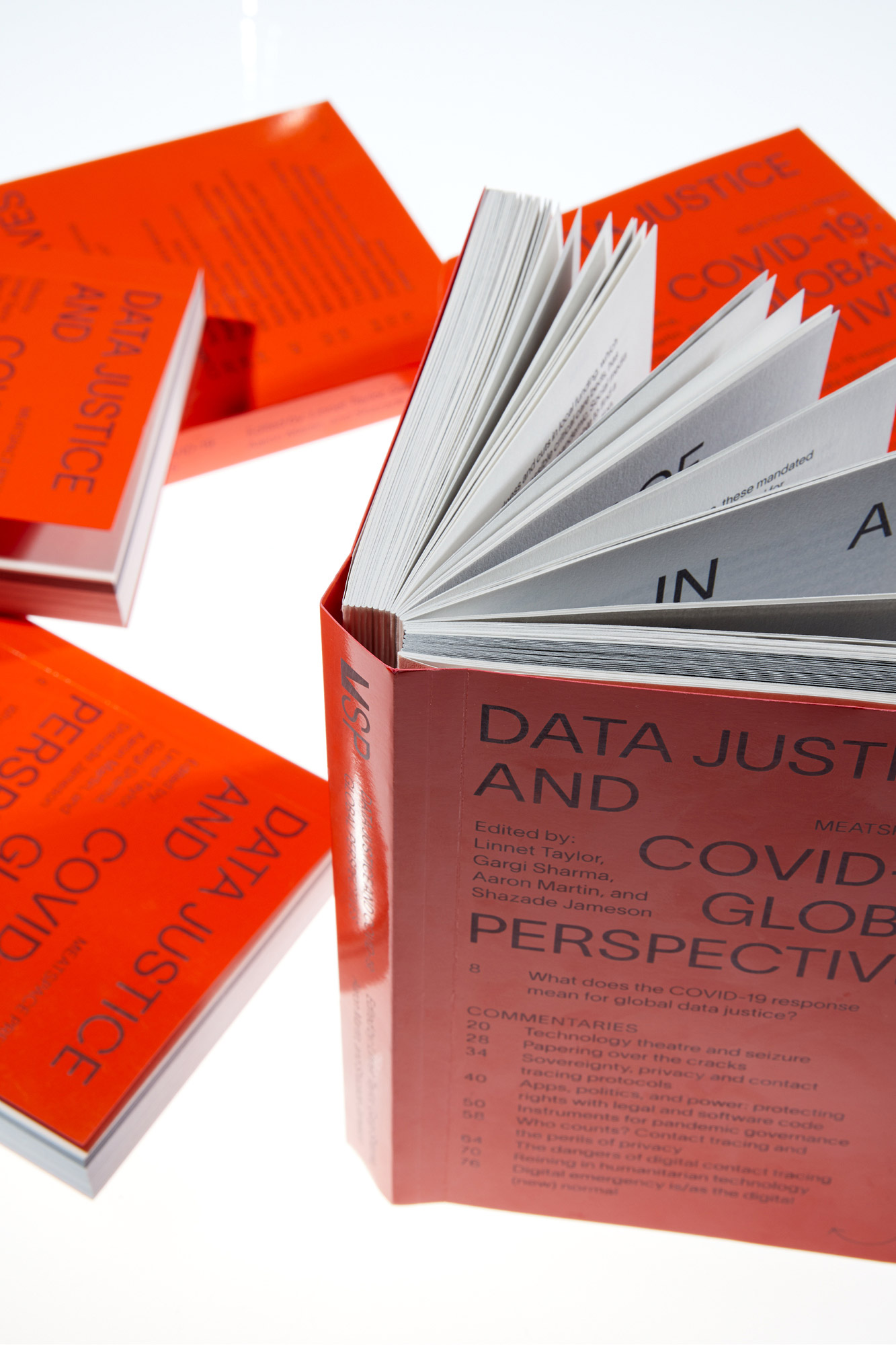
The book contains 38 essays of commentary and analysis comparing and contrasting how different surveillance technologies have been rolled-out in response to the pandemic. With sixty different authors covering events in over thirty countries.
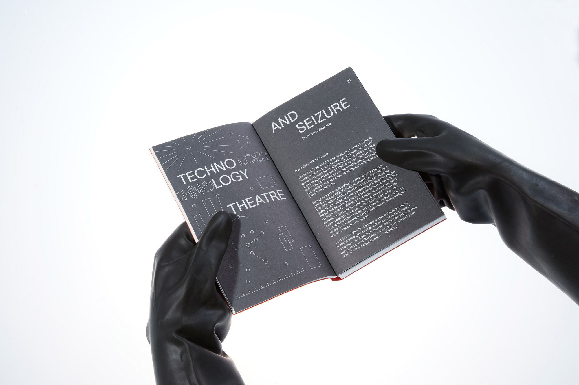
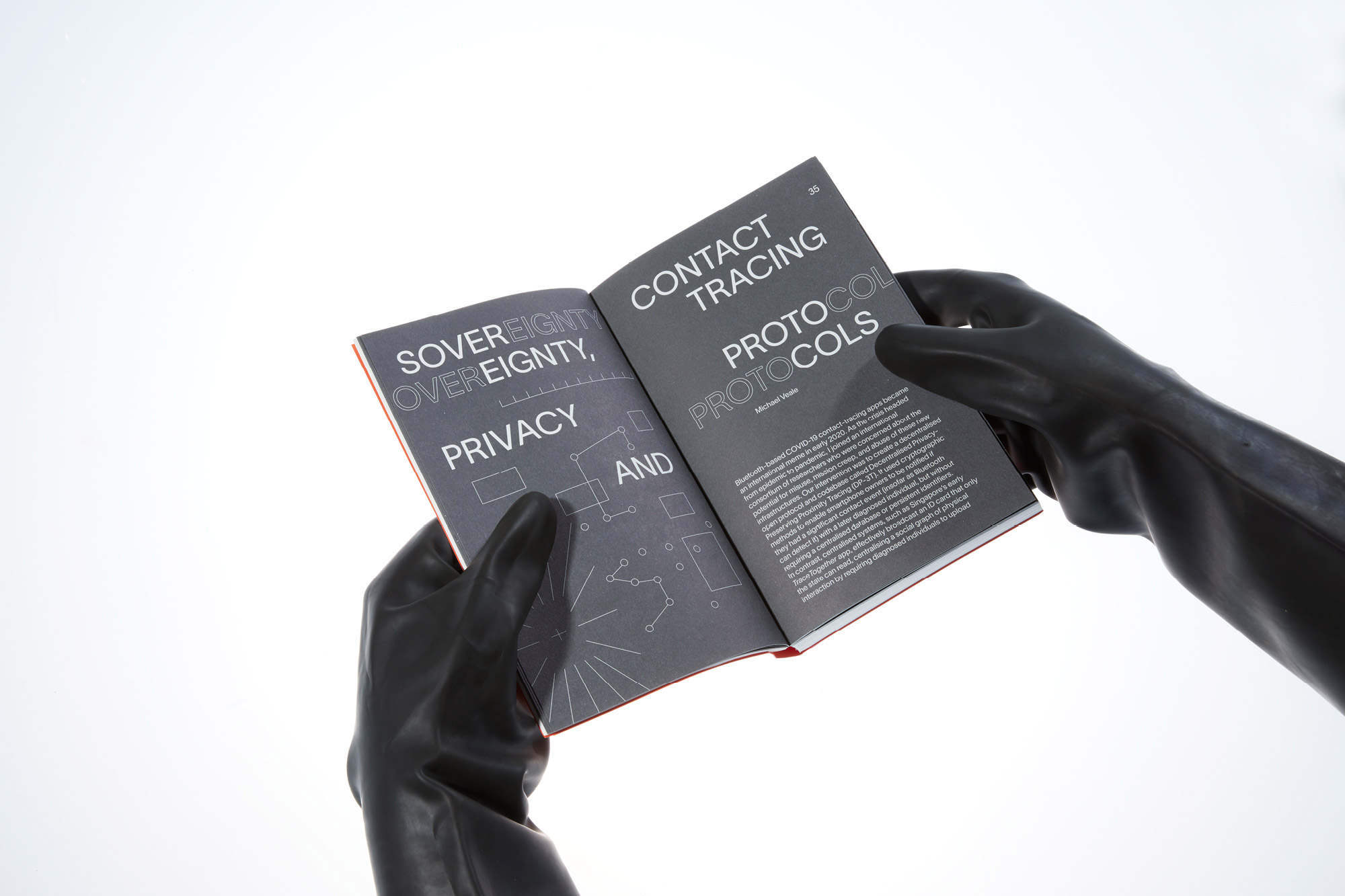
The design of this publication offers visual entry points to the meaning of the word surveillance. Borrowed from the French, it means literally ‘to watch from above’, by the combination of the prefix sur- (‘over’ or ‘above’) and veiller (‘to watch’, derived from the Latin verb vigilare, with the same meaning). This definition led to the development of a series of graphic signifiers presented across the book’s layout and image-making: cartographic, monitoring, documental and tracking visual languages intertwine in overimposed layers.
Photos by Tais Sirote
2 Case Study
2 Case Study
Photos by Tais Sirote
Animation by Mark Crowley
The design of this publication offers visual entry points to the meaning of the word surveillance. Borrowed from the French, it means literally ‘to watch from above’, by the combination of the prefix sur- (‘over’ or ‘above’) and veiller (‘to watch’, derived from the Latin verb vigilare, with the same meaning). This definition led to the development of a series of graphic signifiers presented across the book’s layout and image-making: cartographic, monitoring, documental and tracking visual languages intertwine in overimposed layers.
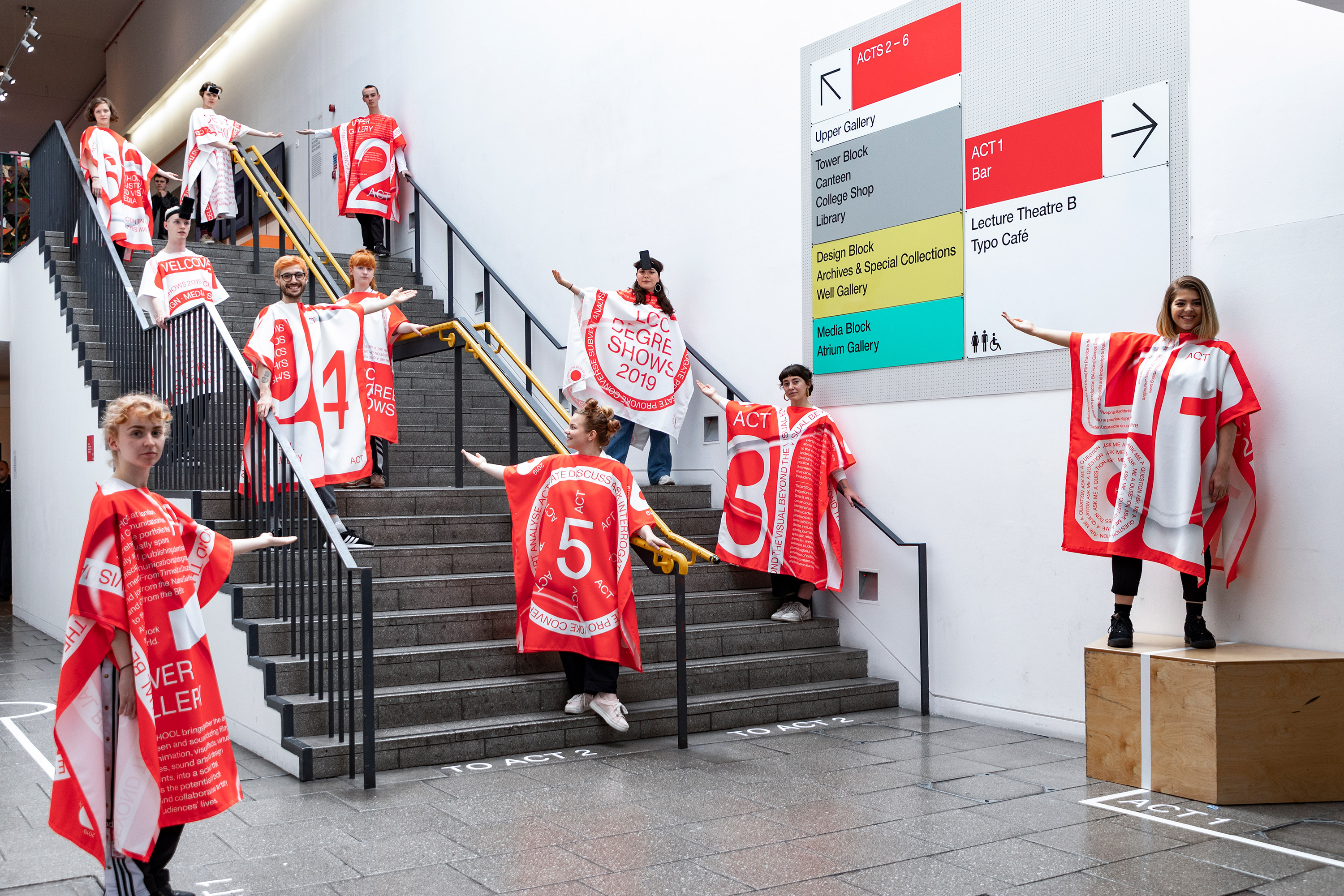
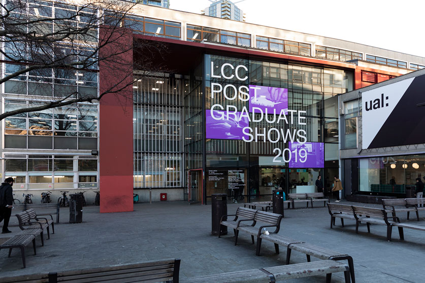
The design of the 2019 degree shows focused in creating a supporting visual system helping to navigate a spatially complex and visually saturated venue such as the London College of Communication. The visual identity proposes an inside/outside duality: an understated and supportive tone for the inside with the aim of highlighting the students’ work; and a loud and dynamic outlook towards the outside and the digital realm.
The design of this publication offers visual entry points to the meaning of the word surveillance. Borrowed from the French, it means literally ‘to watch from above’, by the combination of the prefix sur- (‘over’ or ‘above’) and veiller (‘to watch’, derived from the Latin verb vigilare, with the same meaning). This definition led to the development of a series of graphic signifiers presented across the book’s layout and image-making: cartographic, monitoring, documental and tracking visual languages intertwine in overimposed layers.
The design of the 2019 degree shows focused in creating a supporting visual system helping to navigate a spatially complex and visually saturated venue such as the London College of Communication. The visual identity proposes an inside/outside duality: an understated and supportive tone for the inside with the aim of highlighting the students’ work; and a loud and dynamic outlook towards the outside and the digital realm.
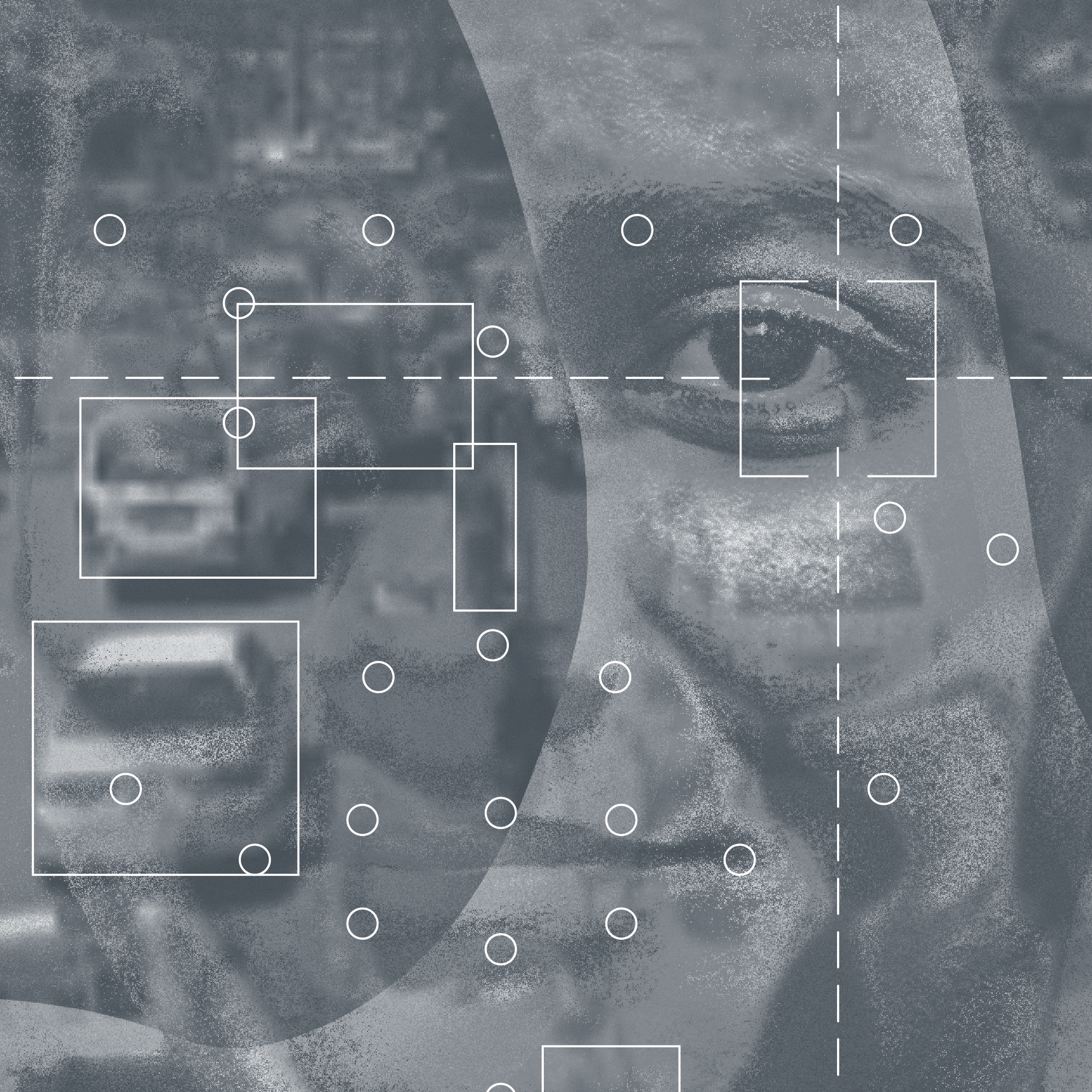
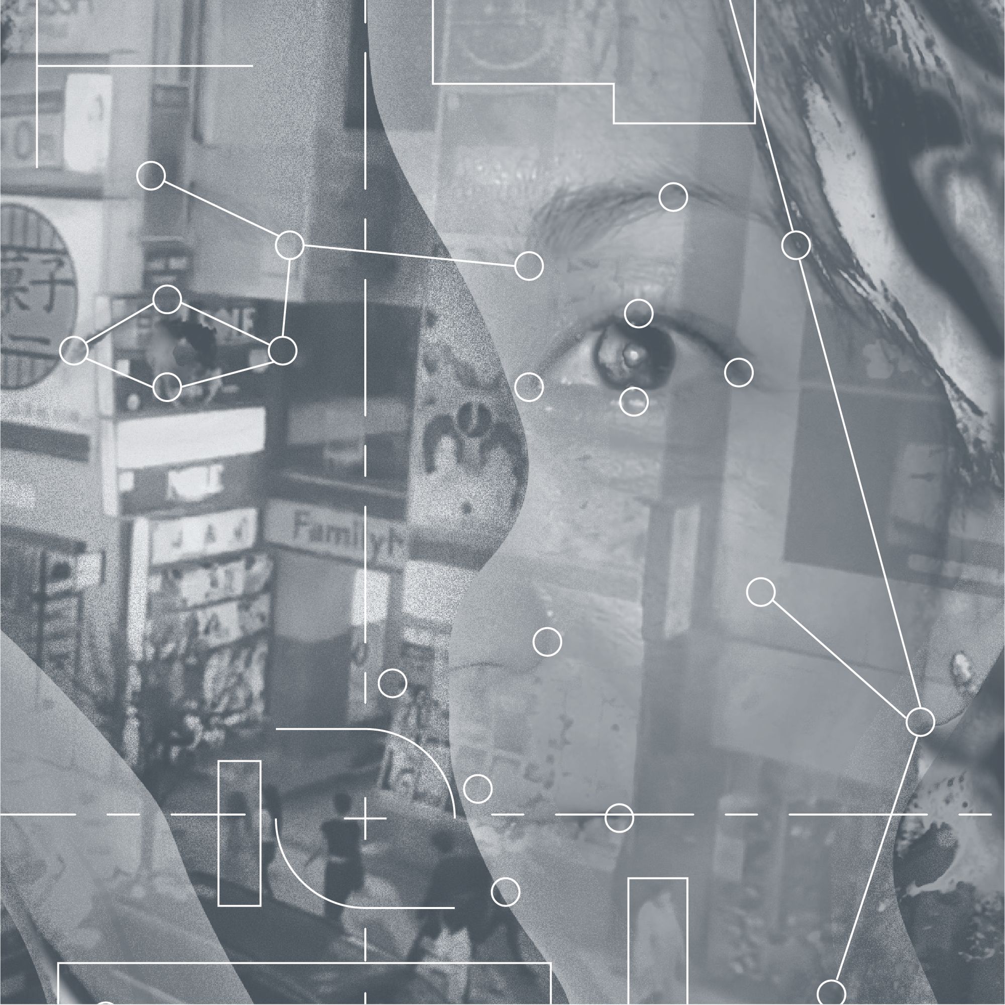
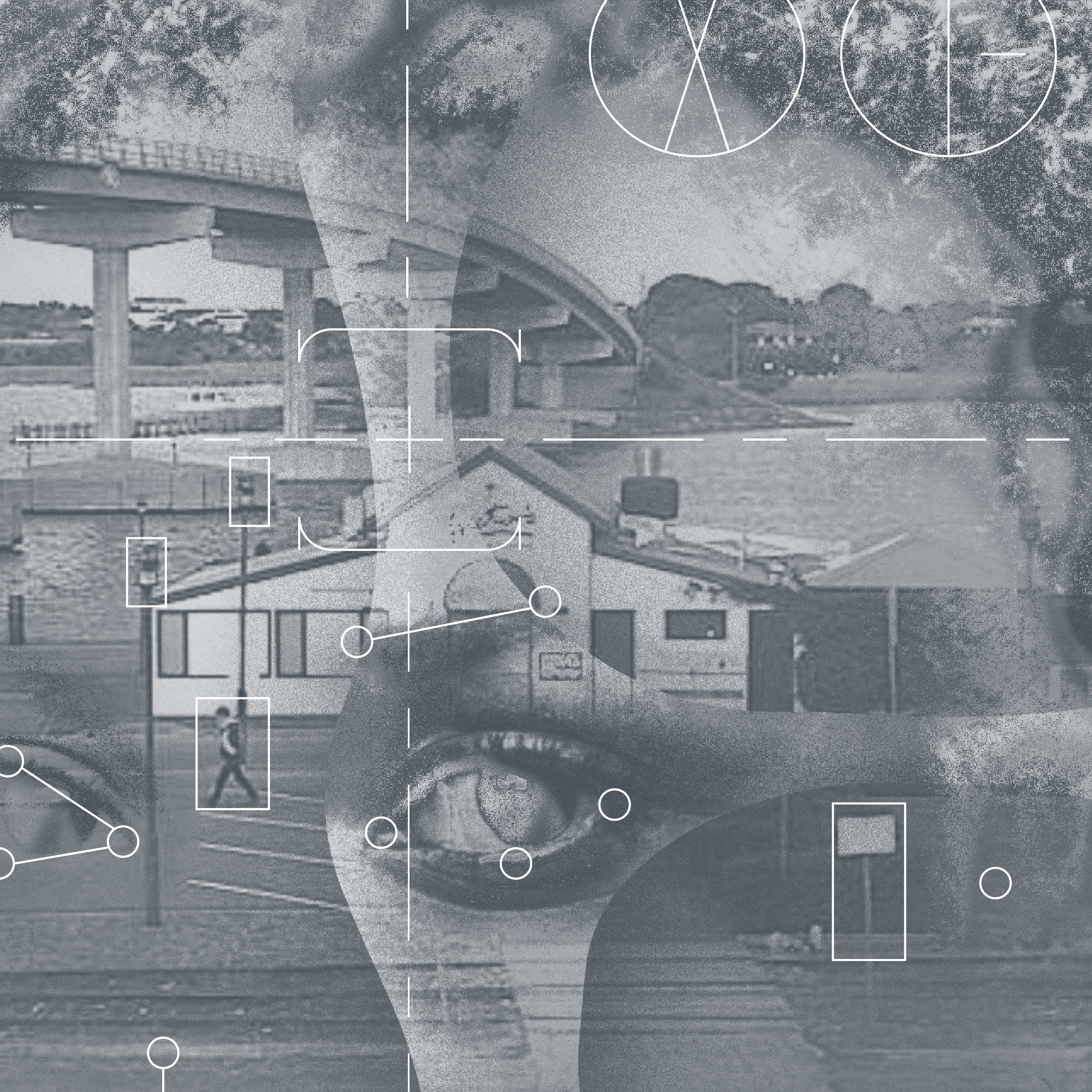
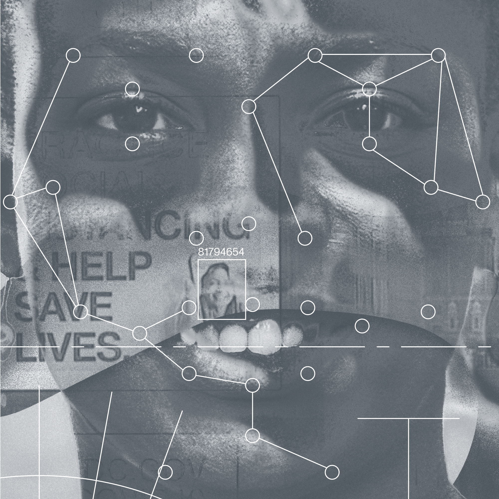
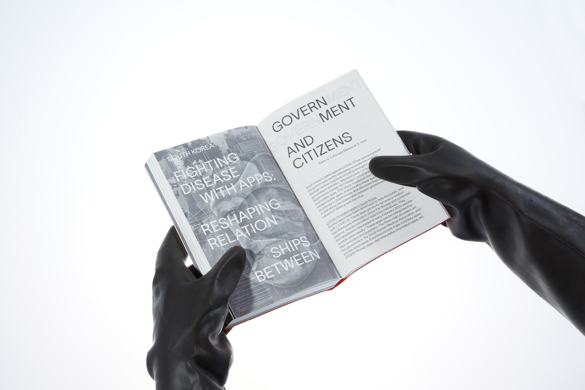
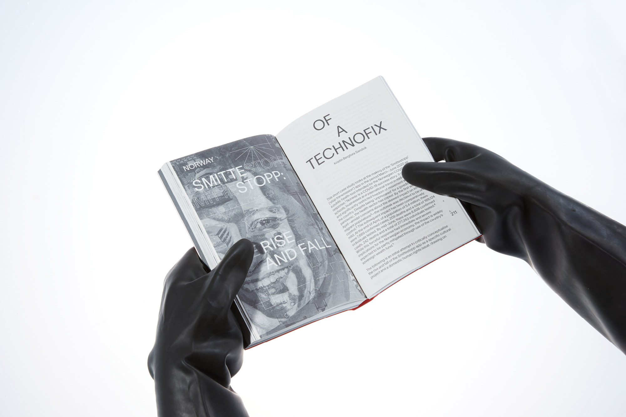
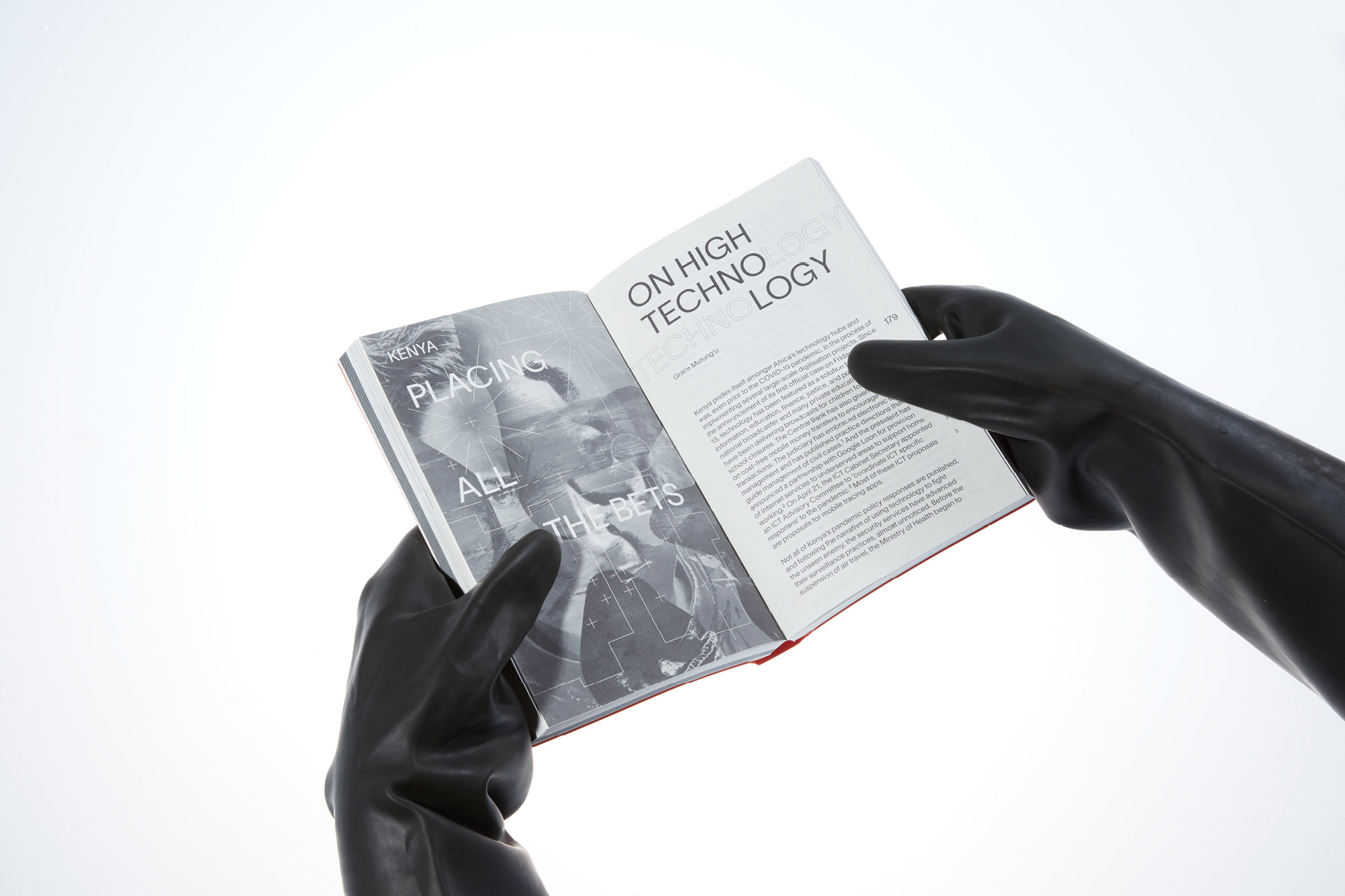
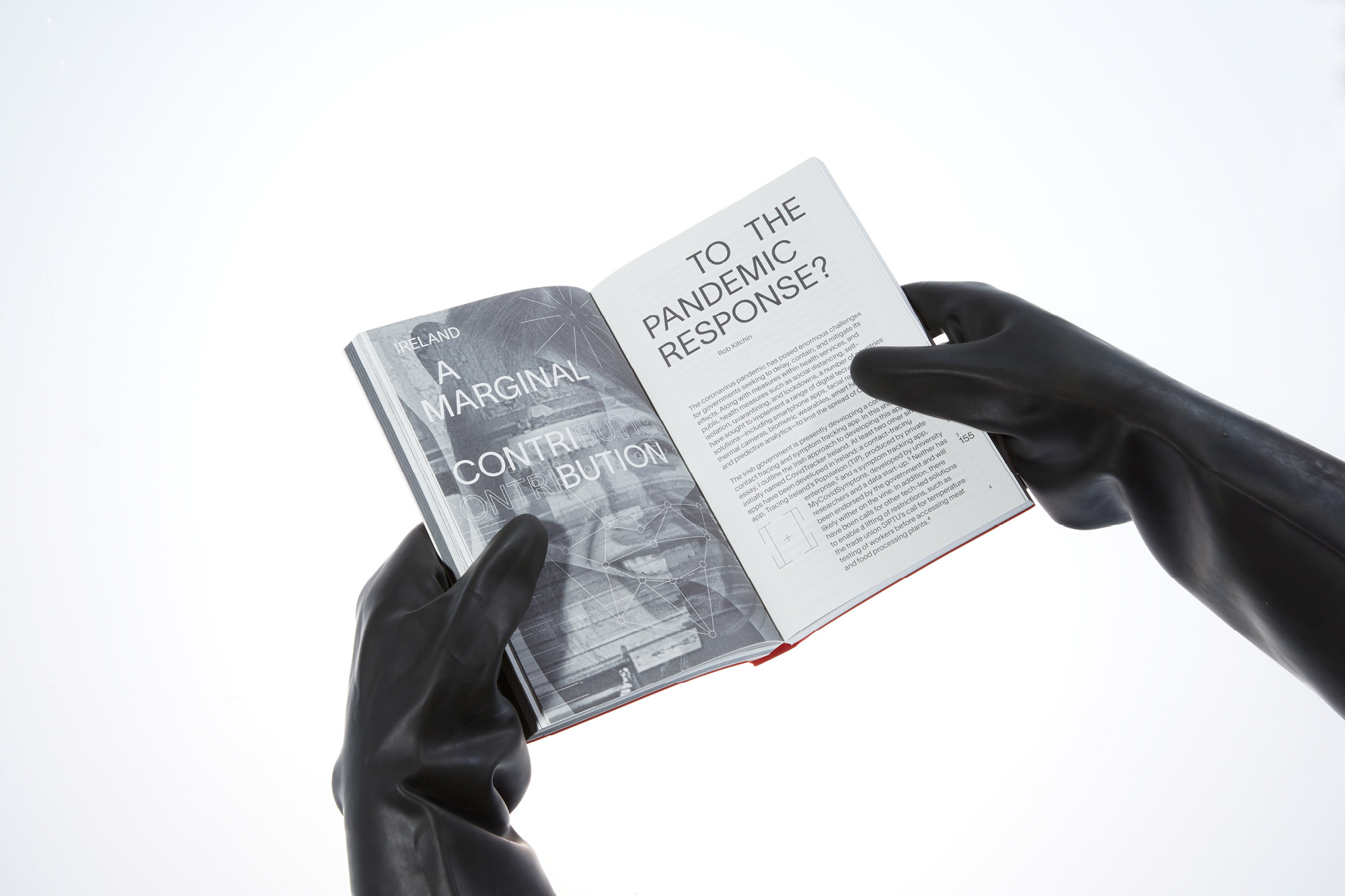
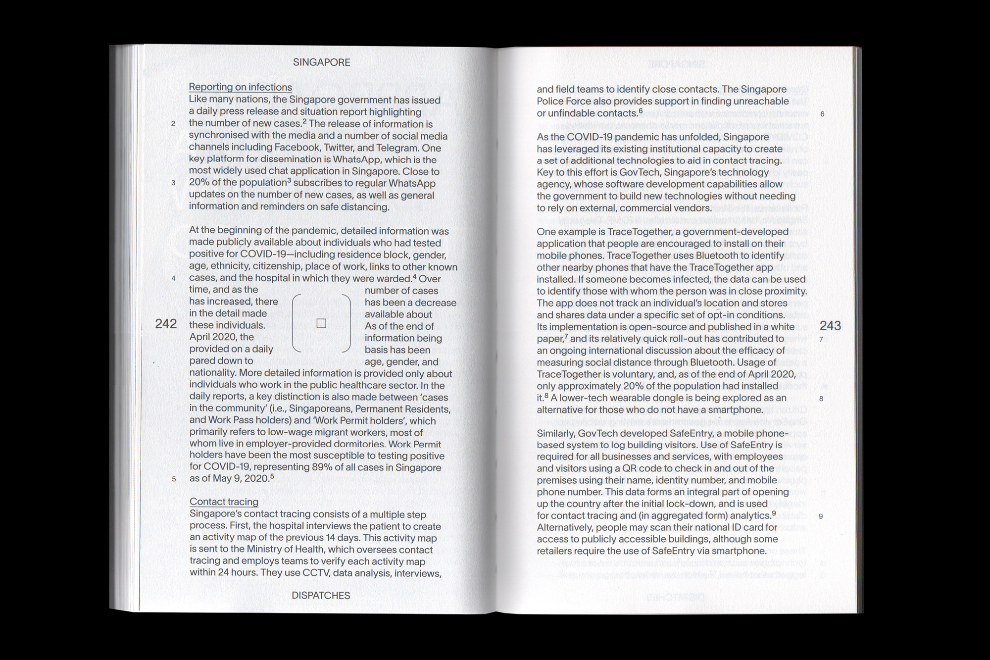
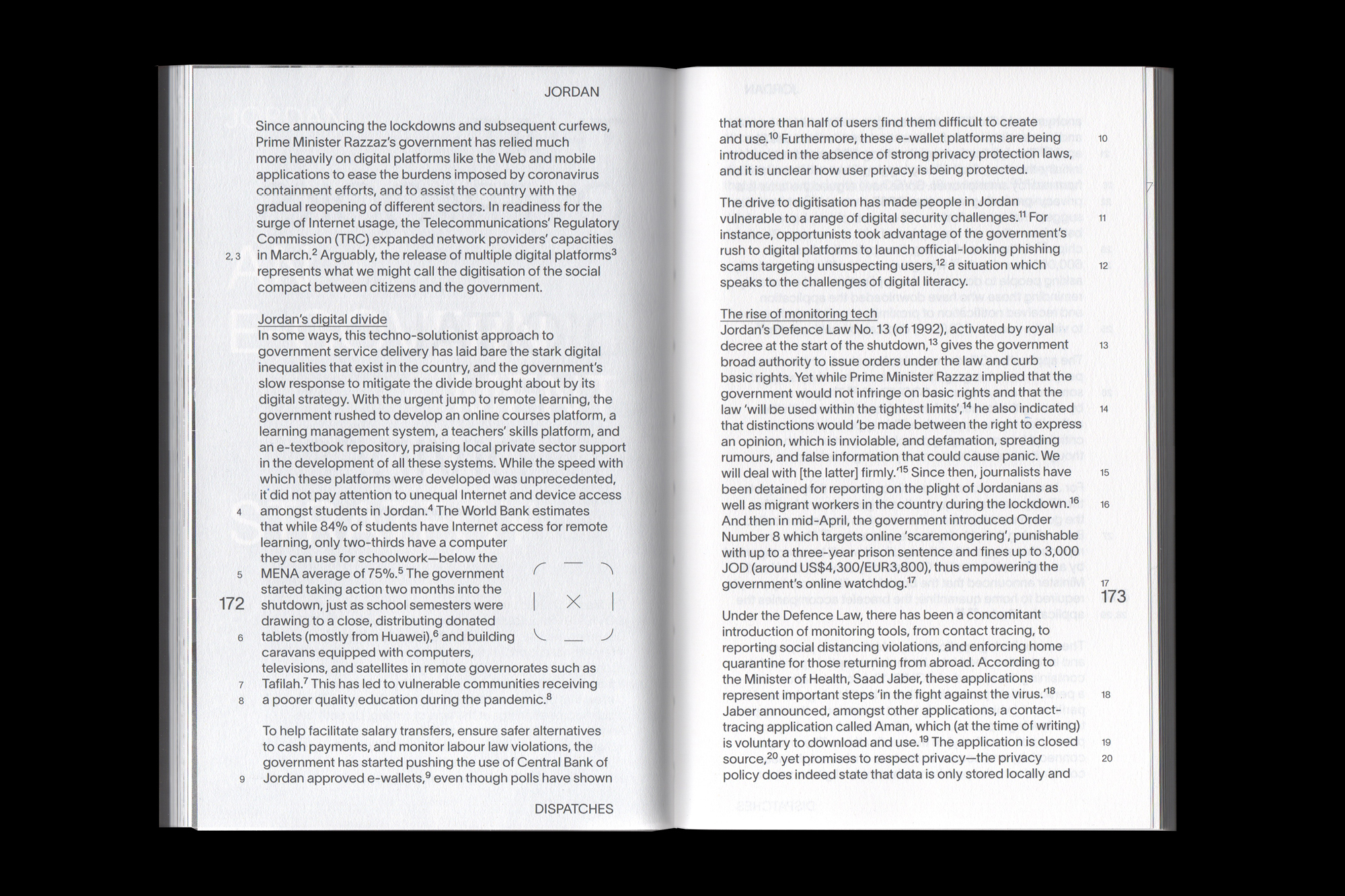
The images at the start of each chapter in the Dispatches section offer a simultaneous read of two realities: the place and the inhabitant. The images are composed of two primary sources: site footage and facial portraits. The collection of openers explores visual manifestations for the notions of ‘datalogical traces’ and ‘biosurveillance’ explored in the book.
The elements are presented as a blend which is challenging to separate; the resulting shared surface raises questions about how publicly available information might be used. The inhabitant is subject to being monitored, while, at the same time, provides access to data and potential surveillance tools unknowingly.
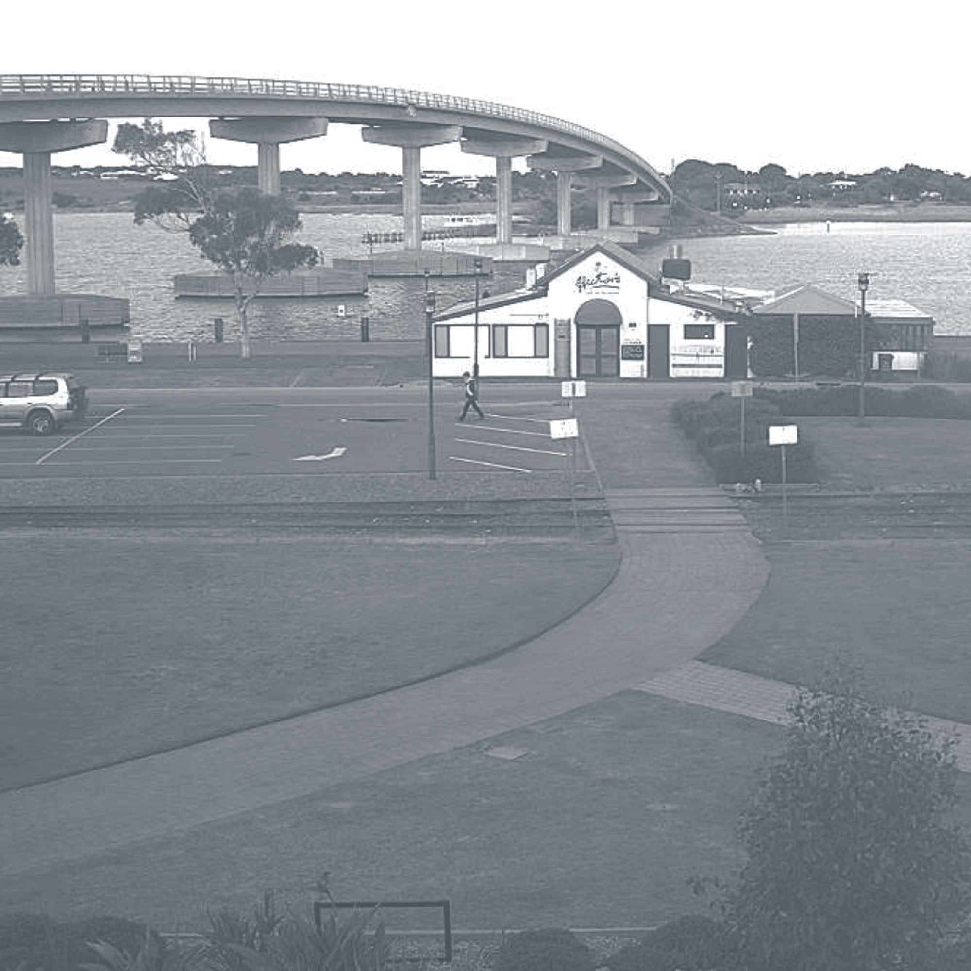
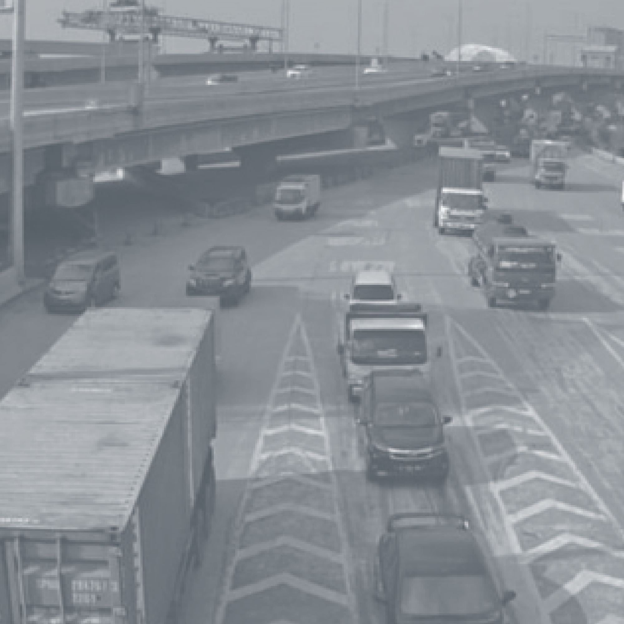
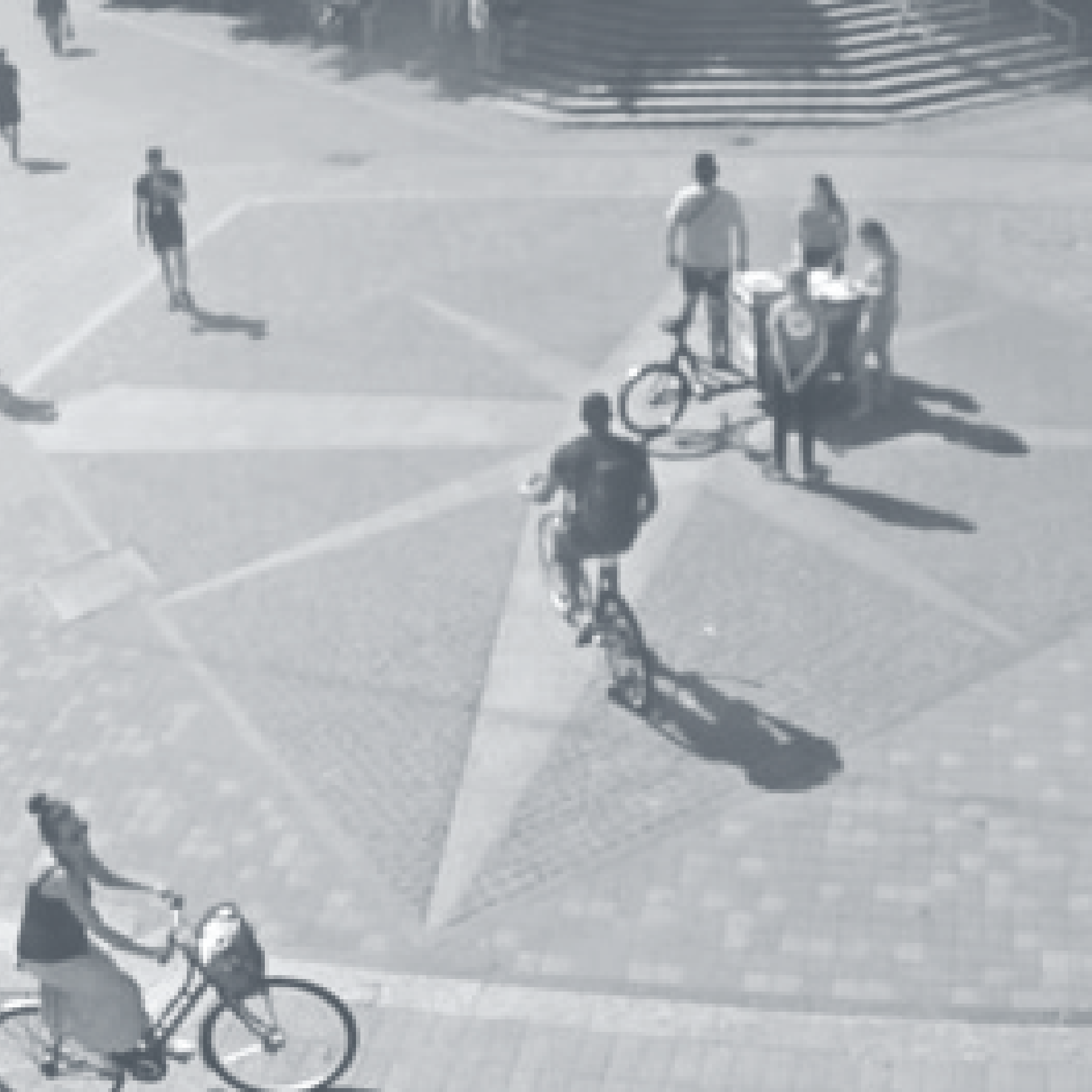
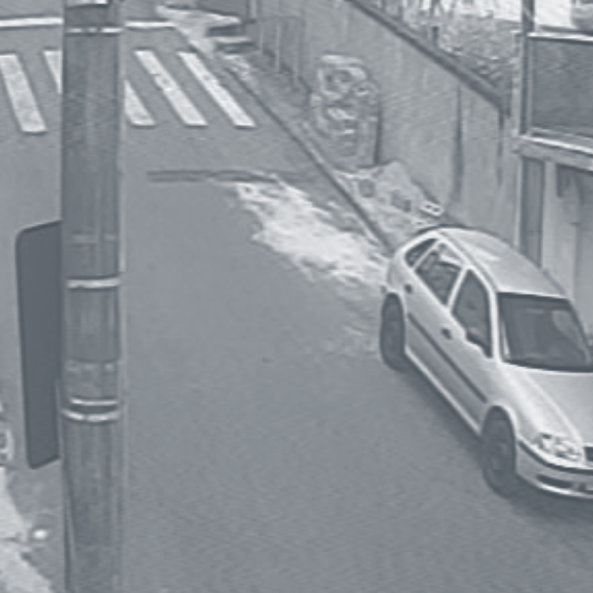
The background imagery contains snapshots taken from publicly accessible CCTV cameras. The images, apparently innocent, raise questions around the IoT (Internet of Things) of security devices. While suggesting a feeling of control by means of providing objective documentation, they are also able to expose bypassers and the life surrounding real estate.

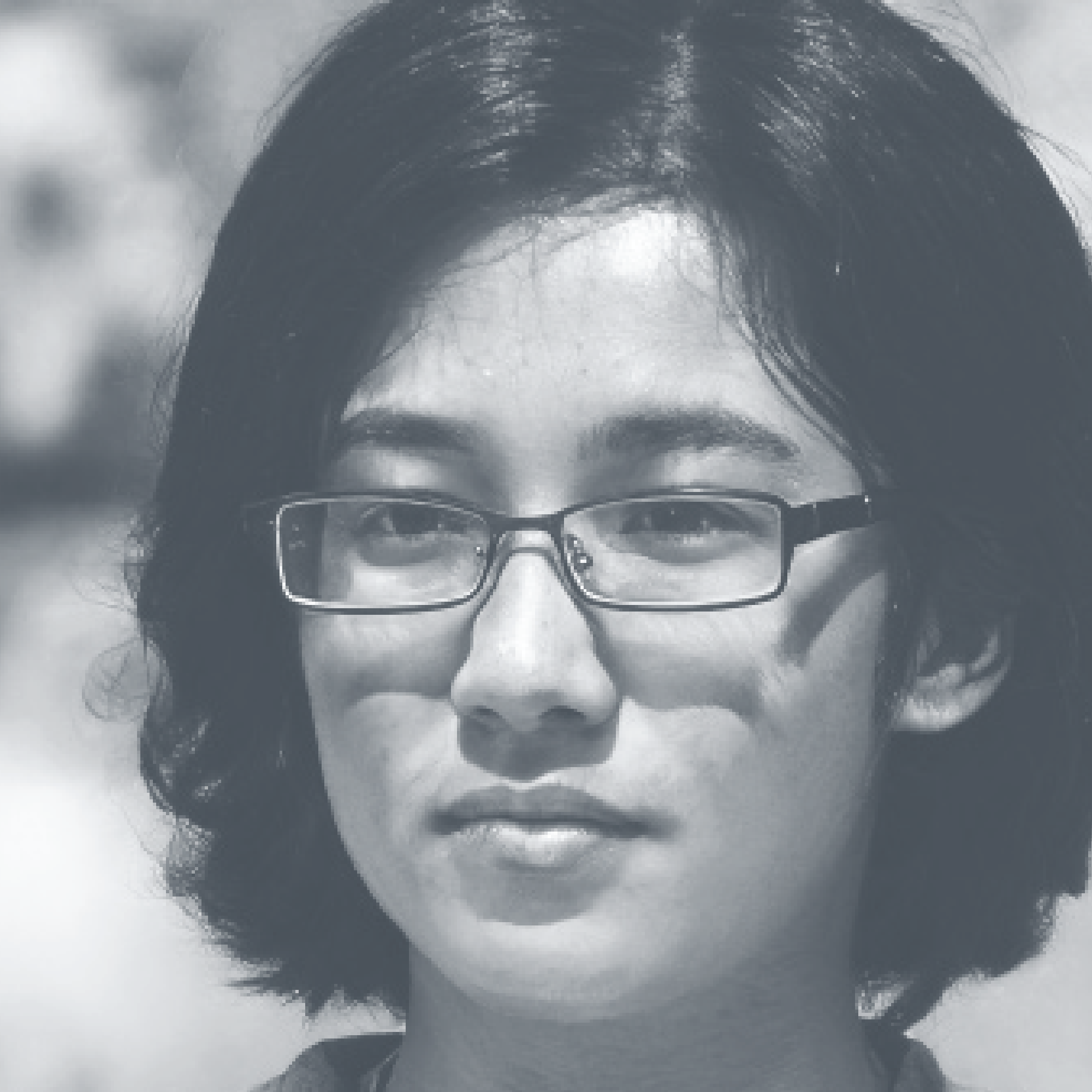
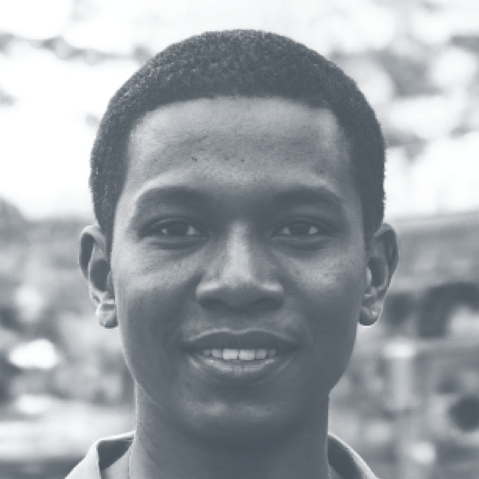

The most recognisable component of the images is a series of portraits, almost mugshots, ‘imagined’ with the AI-based tool This Person Does Not Exist by Philip Wang. This tool, operated by a GAN (Generative Adversarial Network), StyleGAN, produces ‘generative data-driven unconditional’ imagery. The choice of AI-generated portraits questions our trust in the image as a witness of truth. In a more practical sense, it also helps avoid the use of ‘real humans’ in the construction of visual rhetoric.


The two layers are articulated using the typeface Quarantina by Héloïse d’Almeida, as a masking tool. The letterforms are inspired by 1960s horror movie letterings, drawing from the visual component of organic dissemination, especially in the behaviour of moulds and fungi. The choice for this typeface, developed in Paris during the 2020 Covid-19 lockdown, temporally contextualises the design of this book, emphasising how graphic designers respond to the circumstances of their context.
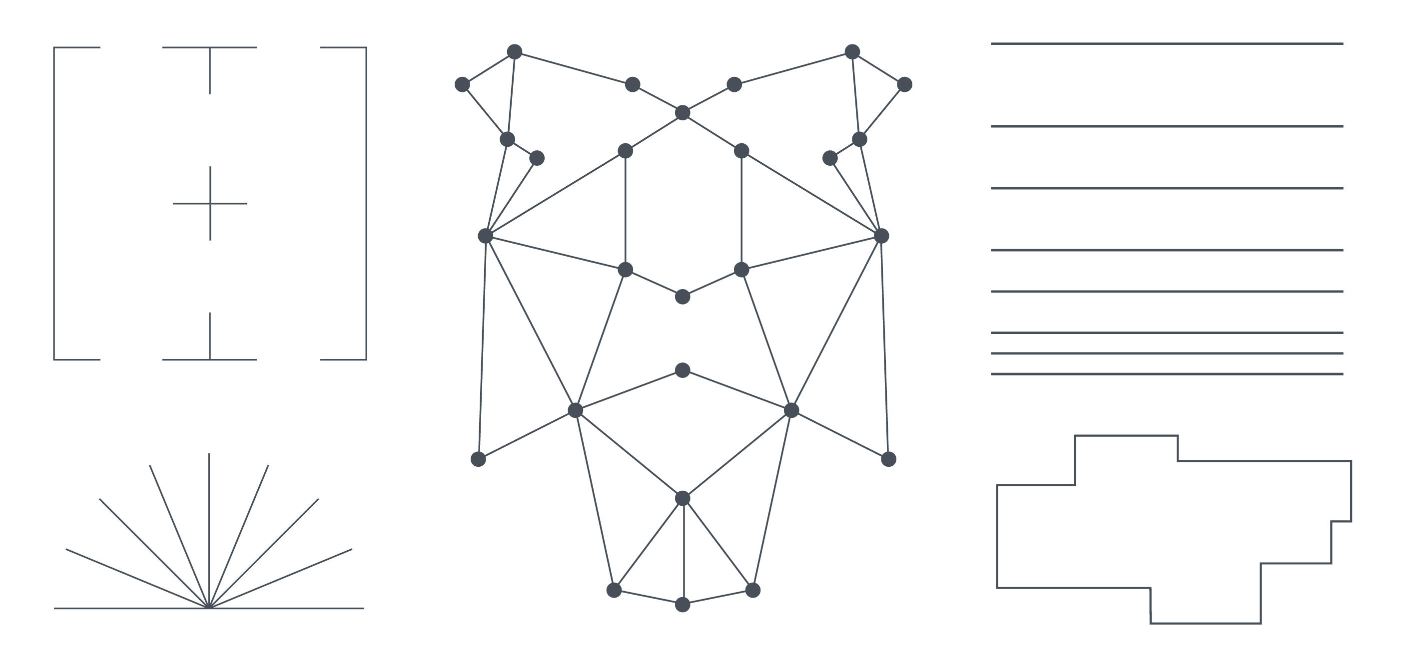
The layout of the publication and the images are often populated with a collection of graphic devices extracted from various monitoring technologies. These, apart from their original functional purposes—to visually manifest supposedly objective measures—entail a particular aesthetic. The visual characteristics and placement over the subjects of observation have become part of the collective imaginary. Crosses, lines, targets, trackers all form part of a visual vocabulary enforcing a fiction of accuracy.
The layout of the publication and the images are often populated with a collection of graphic devices extracted from various monitoring technologies. These, apart from their original functional purposes—to visually manifest supposedly objective measures—entail a particular aesthetic. The visual characteristics and placement over the subjects of observation have become part of the collective imaginary. Crosses, lines, targets, trackers all form part of a visual vocabulary enforcing a fiction of accuracy.
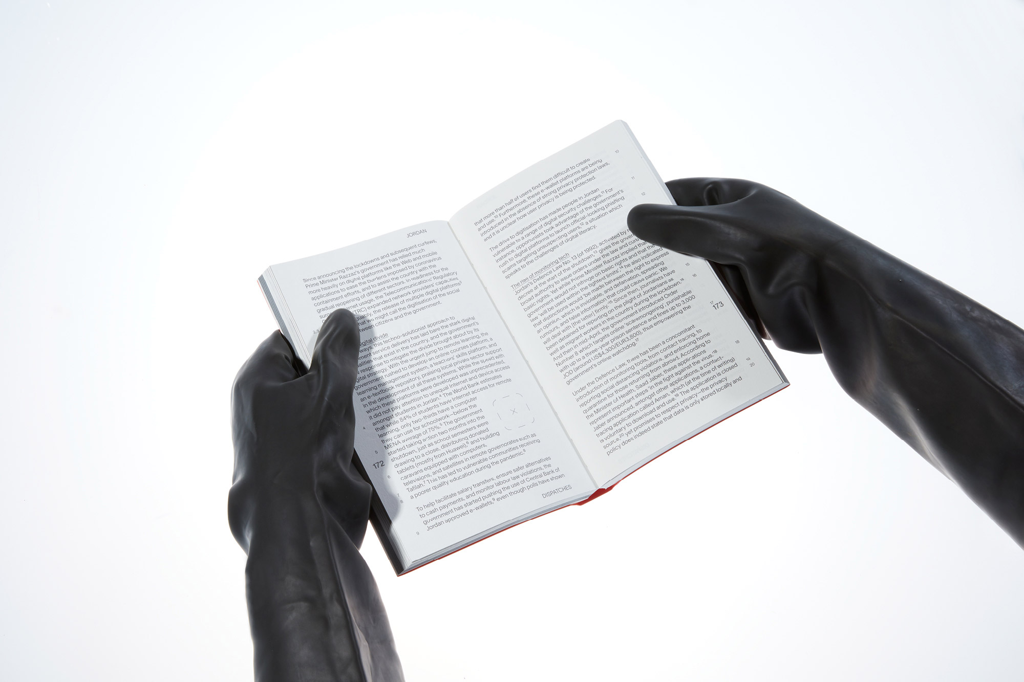
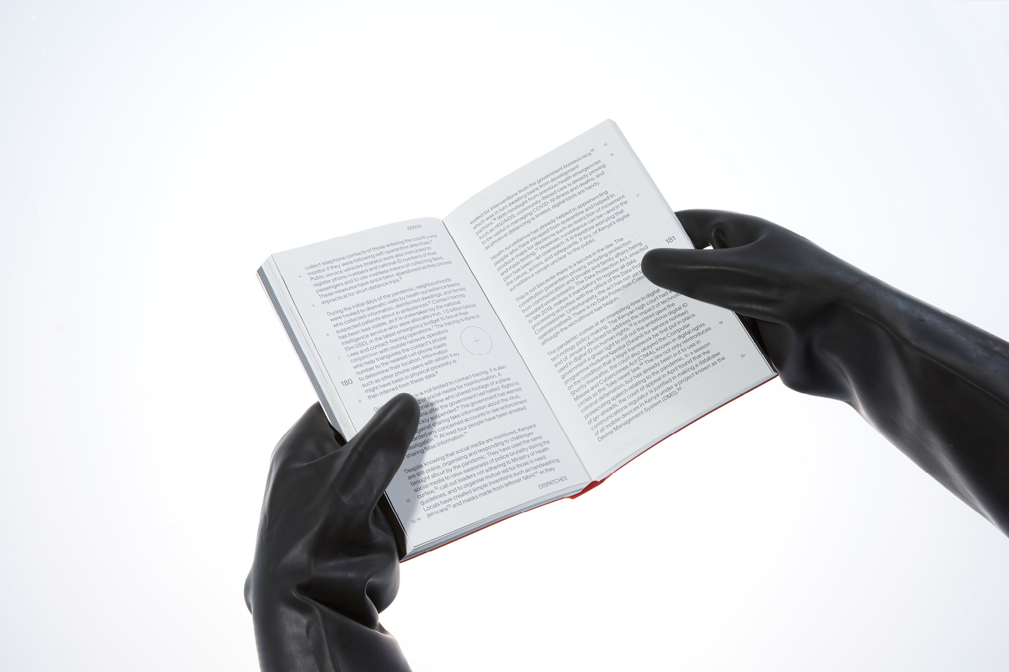
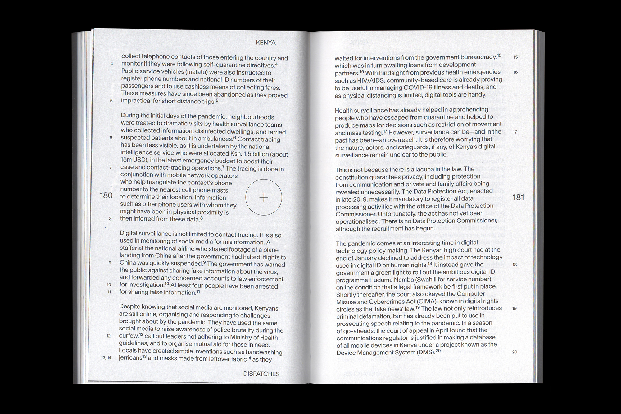
The layout of the folios in the Dispatches section follows a coordinate-like system. It is based on an inverted version of the Gall-Peters cartographic projection, where the north is placed along the bottom edge of the map. The running headers and footers are indicators of the longitude, while the page numbers represent the latitude.
The layout of the folios in the Dispatches section follows a coordinate-like system. It is based on an inverted version of the Gall-Peters cartographic projection, where the north is placed along the bottom edge of the map. The running headers and footers are indicators of the longitude, while the page numbers represent the latitude.
The layout of the folios in the Dispatches section follows a coordinate-like system. It is based on an inverted version of the Gall-Peters cartographic projection, where the north is placed along the bottom edge of the map. The running headers and footers are indicators of the longitude, while the page numbers represent the latitude.
The layout of the folios in the Dispatches section follows a coordinate-like system. It is based on an inverted version of the Gall-Peters cartographic projection, where the north is placed along the bottom edge of the map. The running headers and footers are indicators of the longitude, while the page numbers represent the latitude.
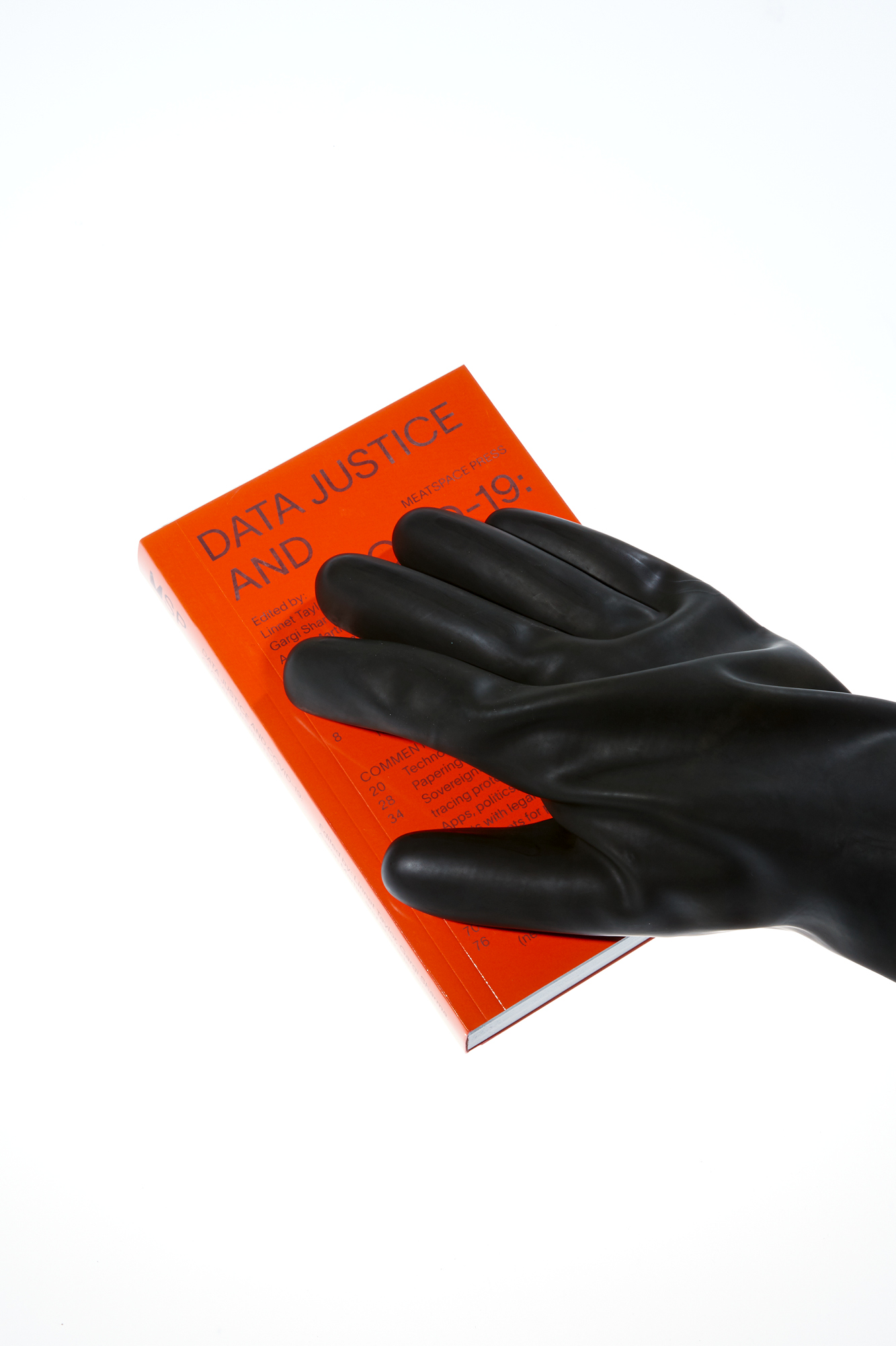
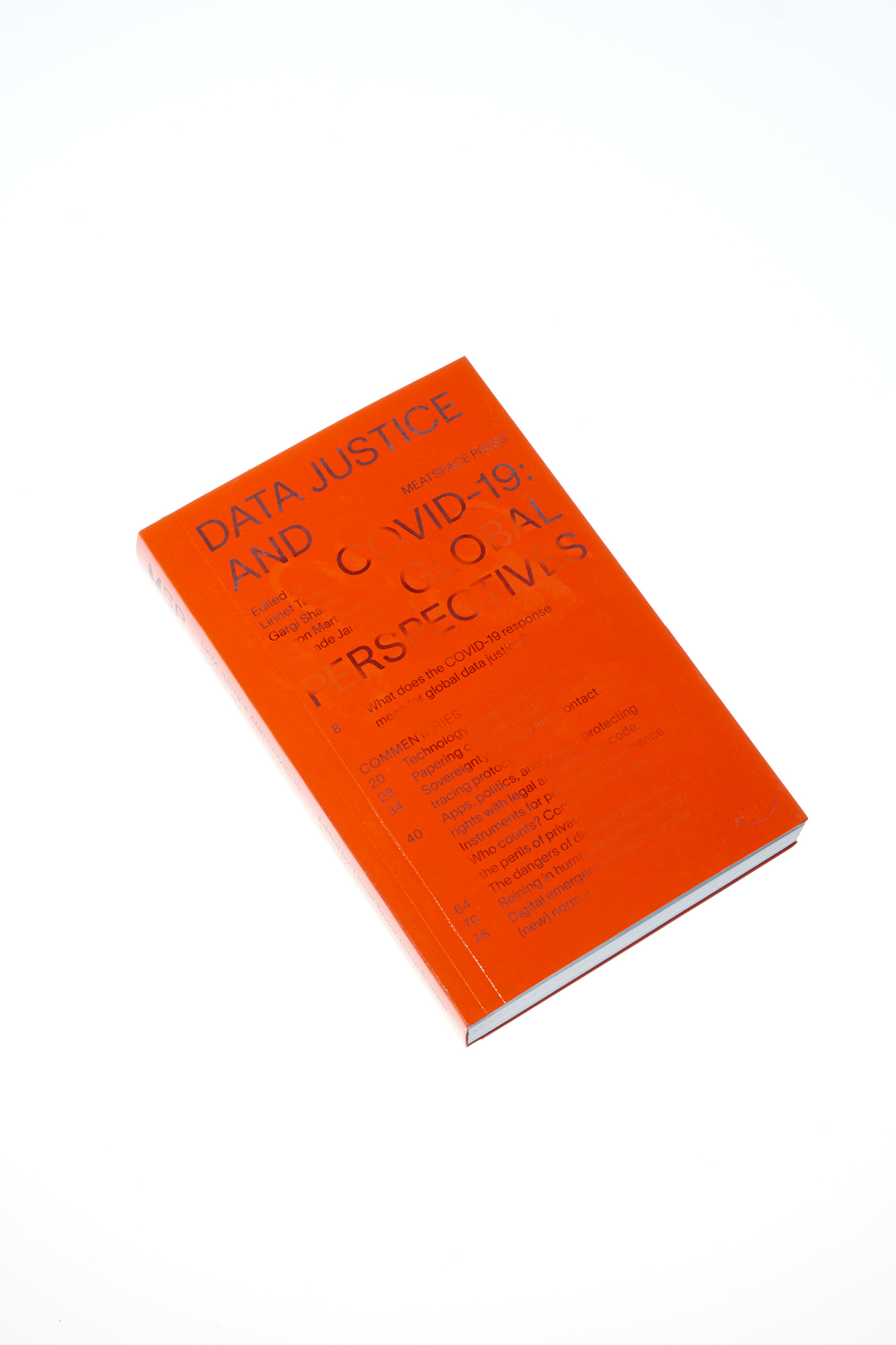
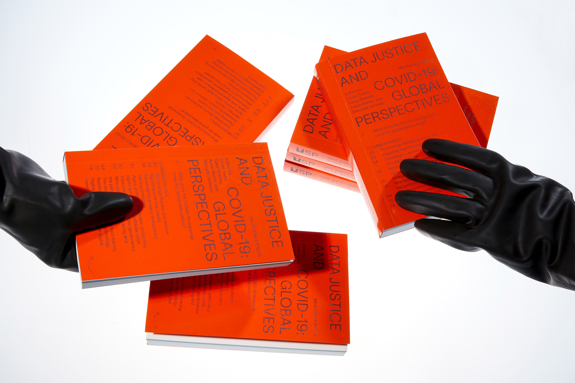
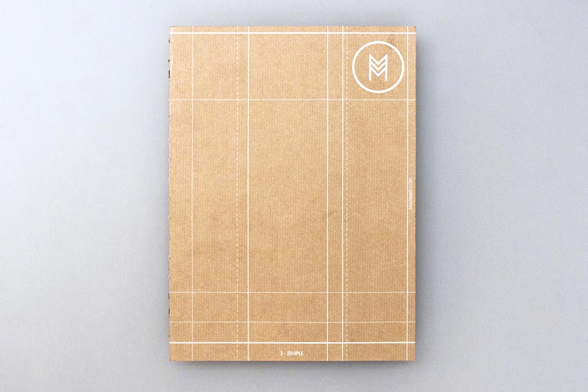
The cover of the book is screen printed with a thermochromatic ink which disappears when exposed to a source of heat. In a context where we have become increasingly alert of our contact with unknown objects, the design reminds of the impossibility of isolating ourselves completely from the world.
The cover of the book is screen printed with a thermochromatic ink which disappears when exposed to a source of heat. In a context where we have become increasingly alert of our contact with unknown objects, the design reminds of the impossibility of isolating ourselves completely from the world.
The cover of the book is screen printed with a thermochromatic ink which disappears when exposed to a source of heat. In a context where we have become increasingly alert of our contact with unknown objects, the design reminds of the impossibility of isolating ourselves completely from the world.
The cover of the book is screen printed with a thermochromatic ink which disappears when exposed to a source of heat. In a context where we have become increasingly alert of our contact with unknown objects, the design reminds of the impossibility of isolating ourselves completely from the world.
Other Works

test sliderProject type
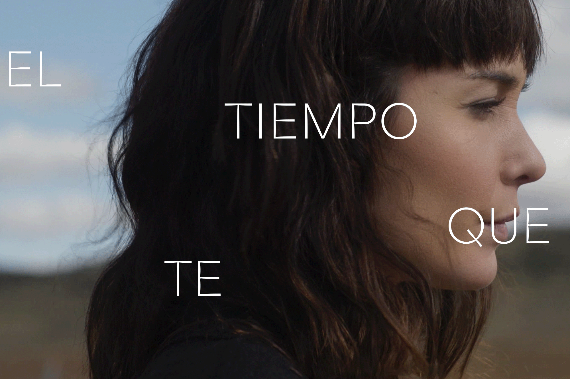
The Time it TakesMotion Graphics
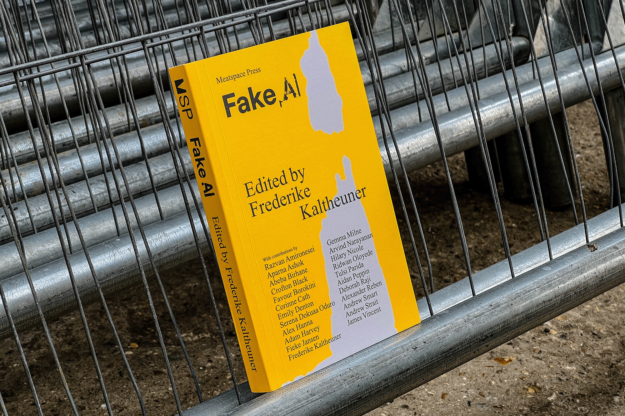
Fake AIEditorial
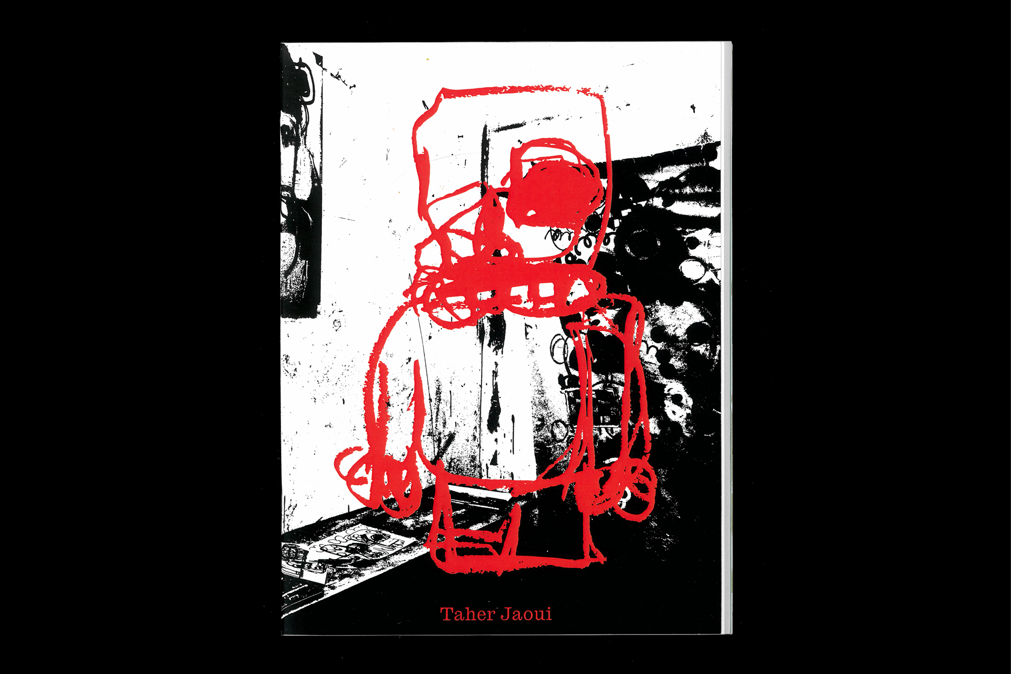
Taher Jaoui: Sketches 2022Artist Book
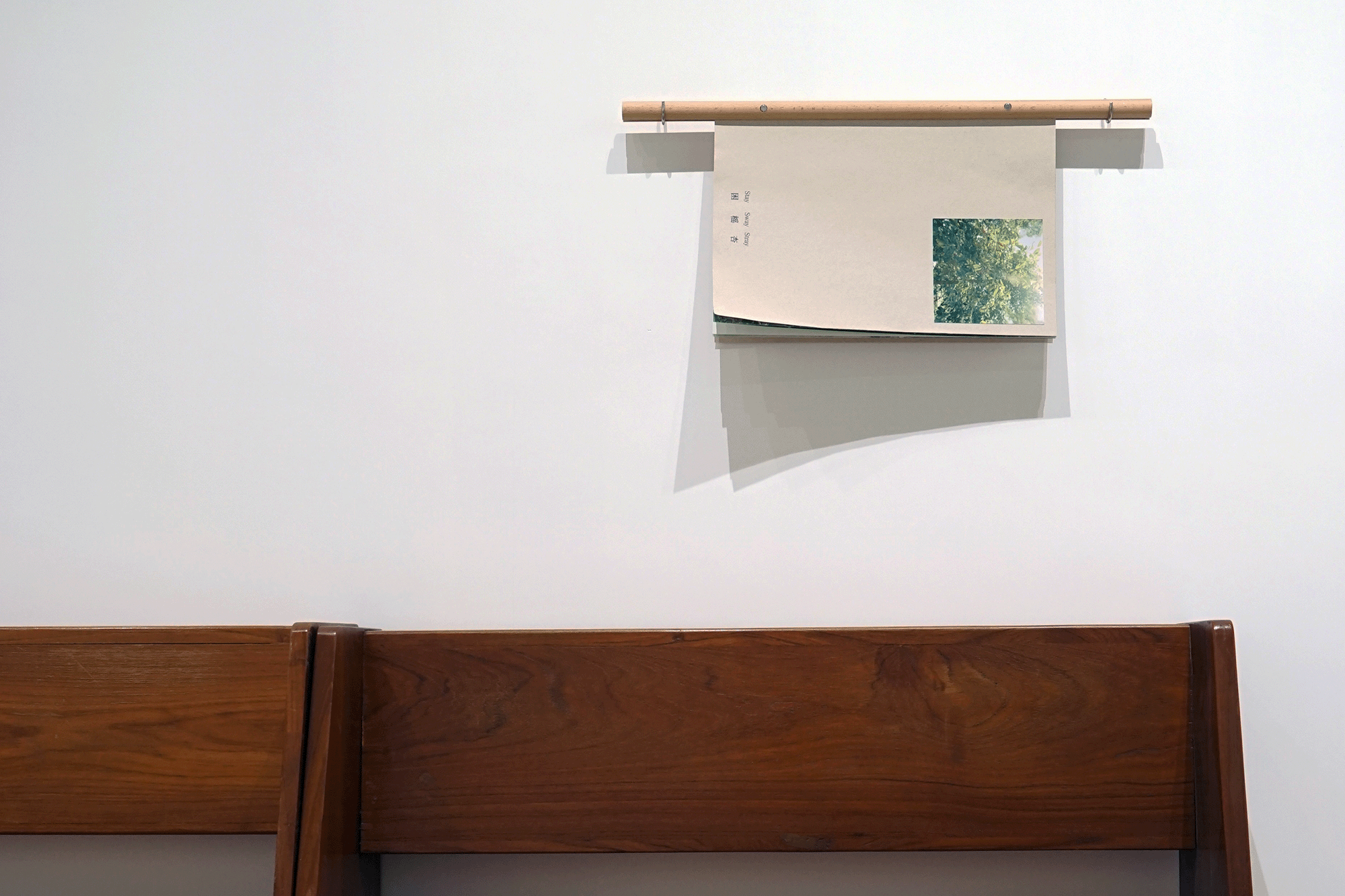
Stay/Sway/Stray (困榣杏)Artist Book
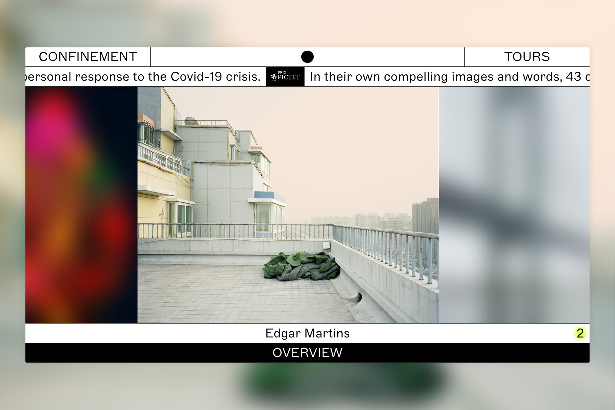
ConfinementExhibition
Data Justice and COVID-19Editorial
LCC Degree Shows 2019Exhibition
HTRCLAEditorial
LCC Postgraduate ShowsExhibition
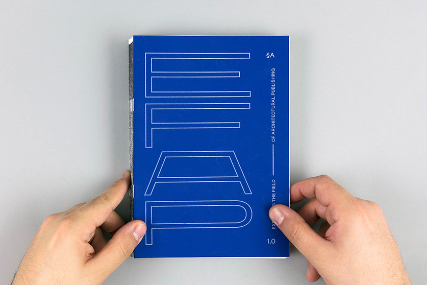
Expanding the Field of Architectural PublishingEditorial, Research
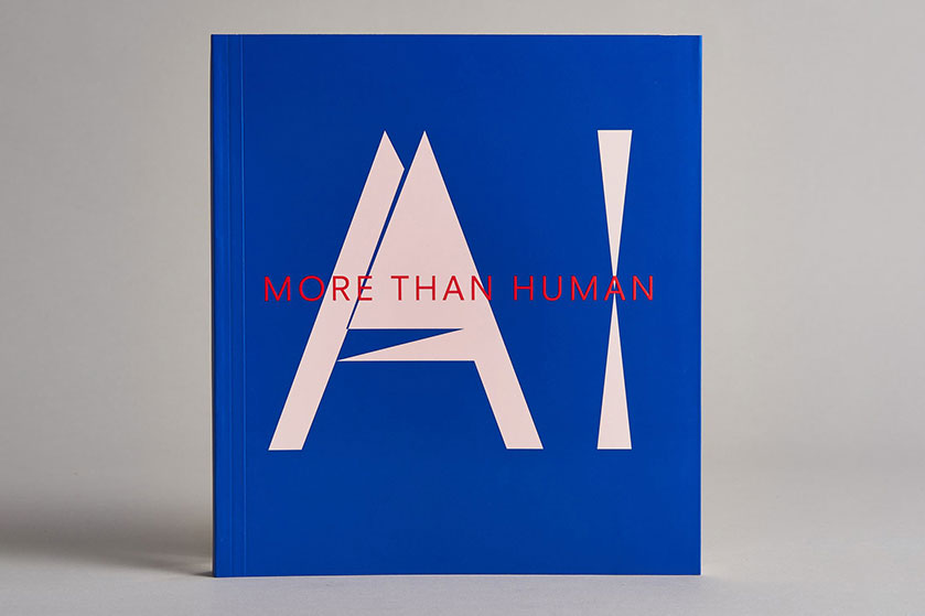
AI: More than HumanEditorial
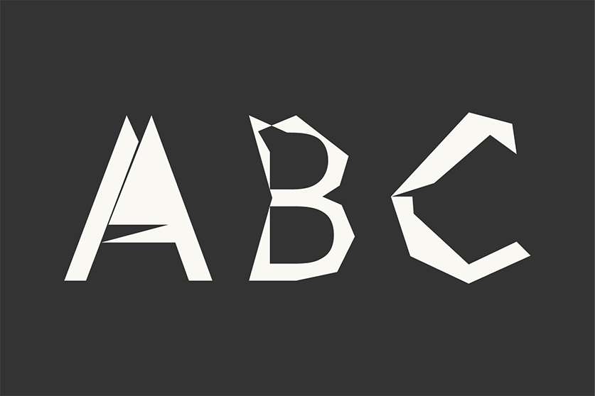
Digi Grotesk AIType
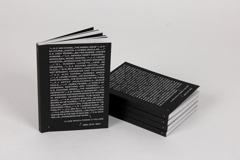
A Line which Forms a VolumeEditorial
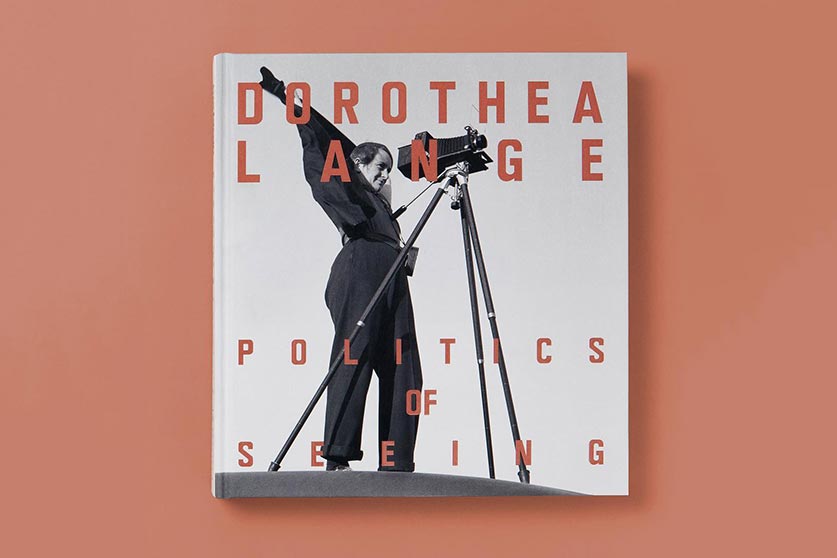
Dorothea Lange: Politics of SeeingEditorial, Exhibition
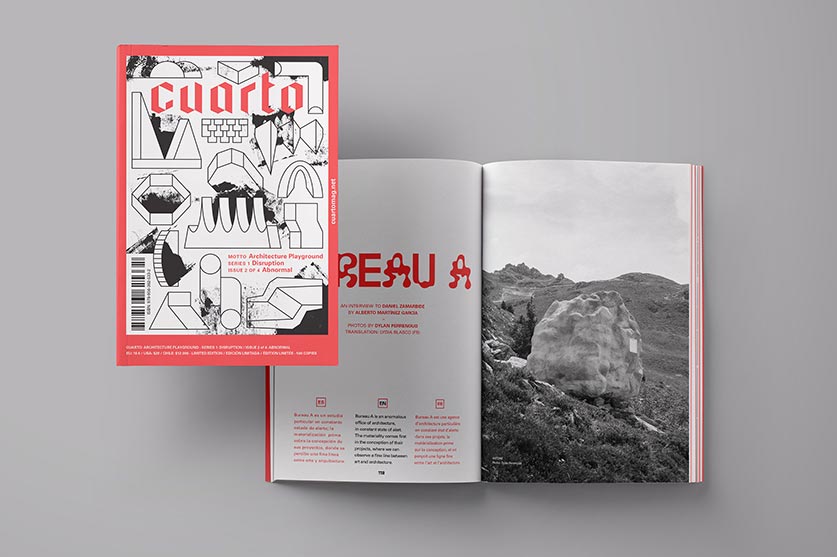
Cuarto: Architecture PlaygroundEditorial, Art Direction
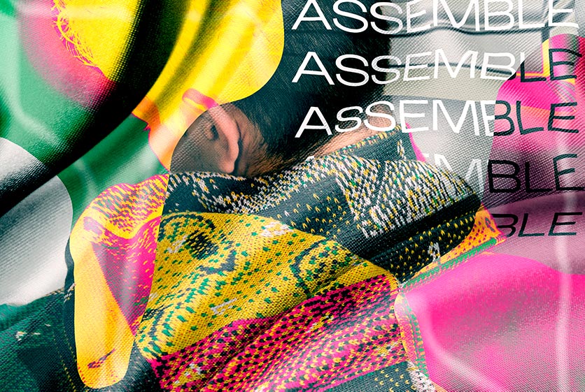
CoversEditorial, Textile
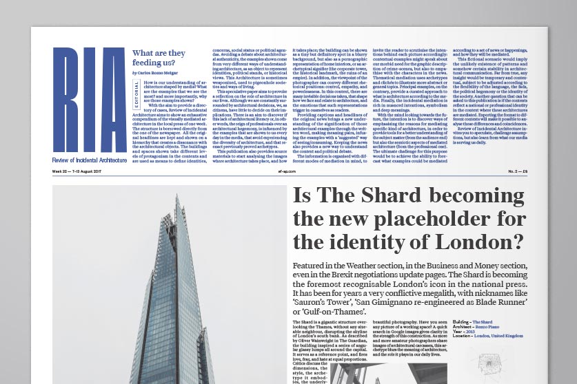
Review of Incidental ArchitectureResearch, Editorial
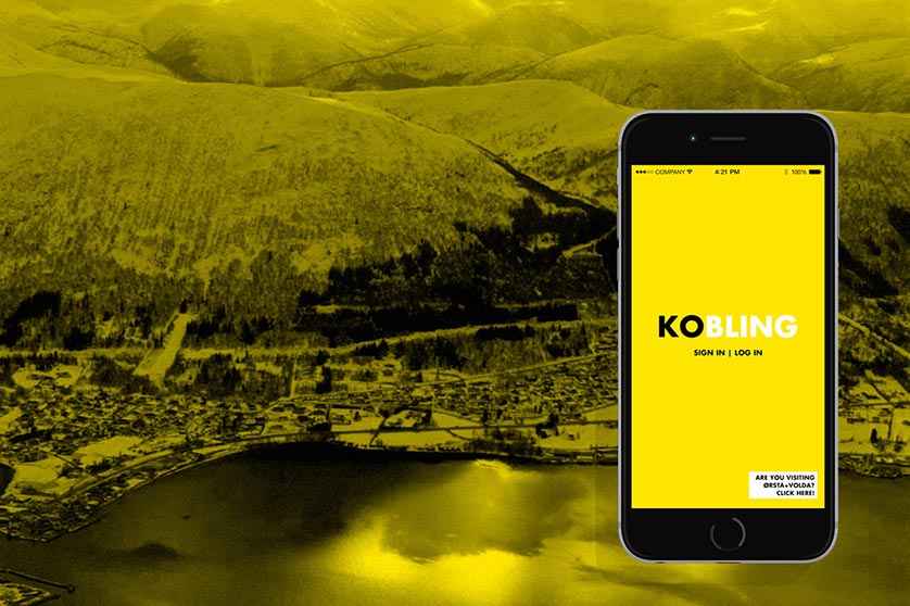
HyperkoblingResearch, Digital Design
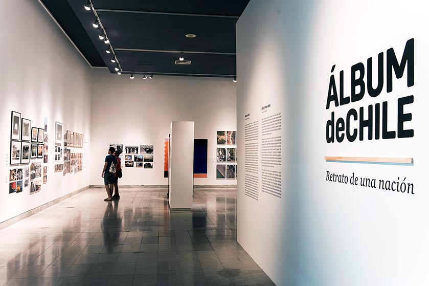
Album de ChileEditorial, Branding, Exhibition
MalamagArt Direction, Graphic Design