Carlos Romo-Melgar
→ Works
→ → Covers
Self-initiated project
ROLE: Art Direction, Graphic Design
LOCATION: London
DATE: 2017
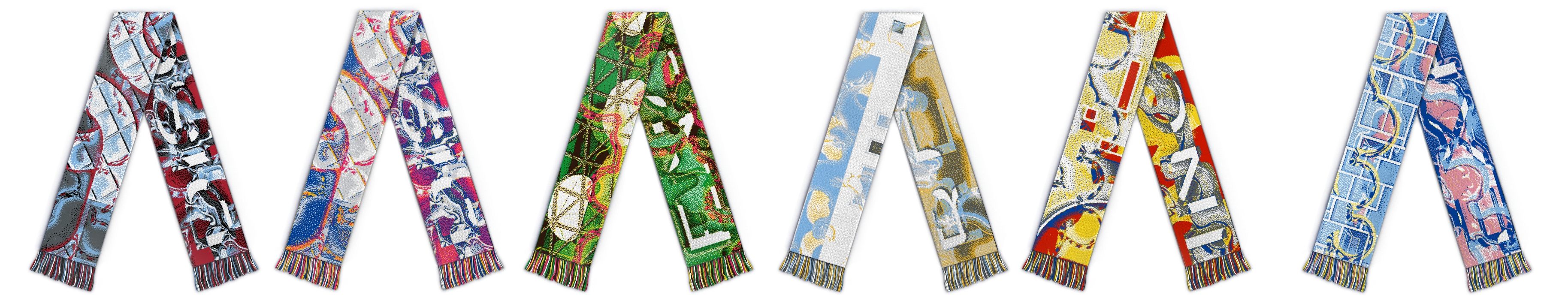
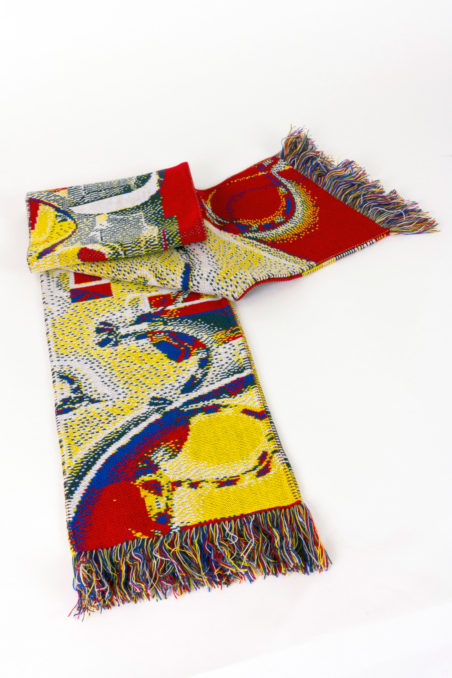
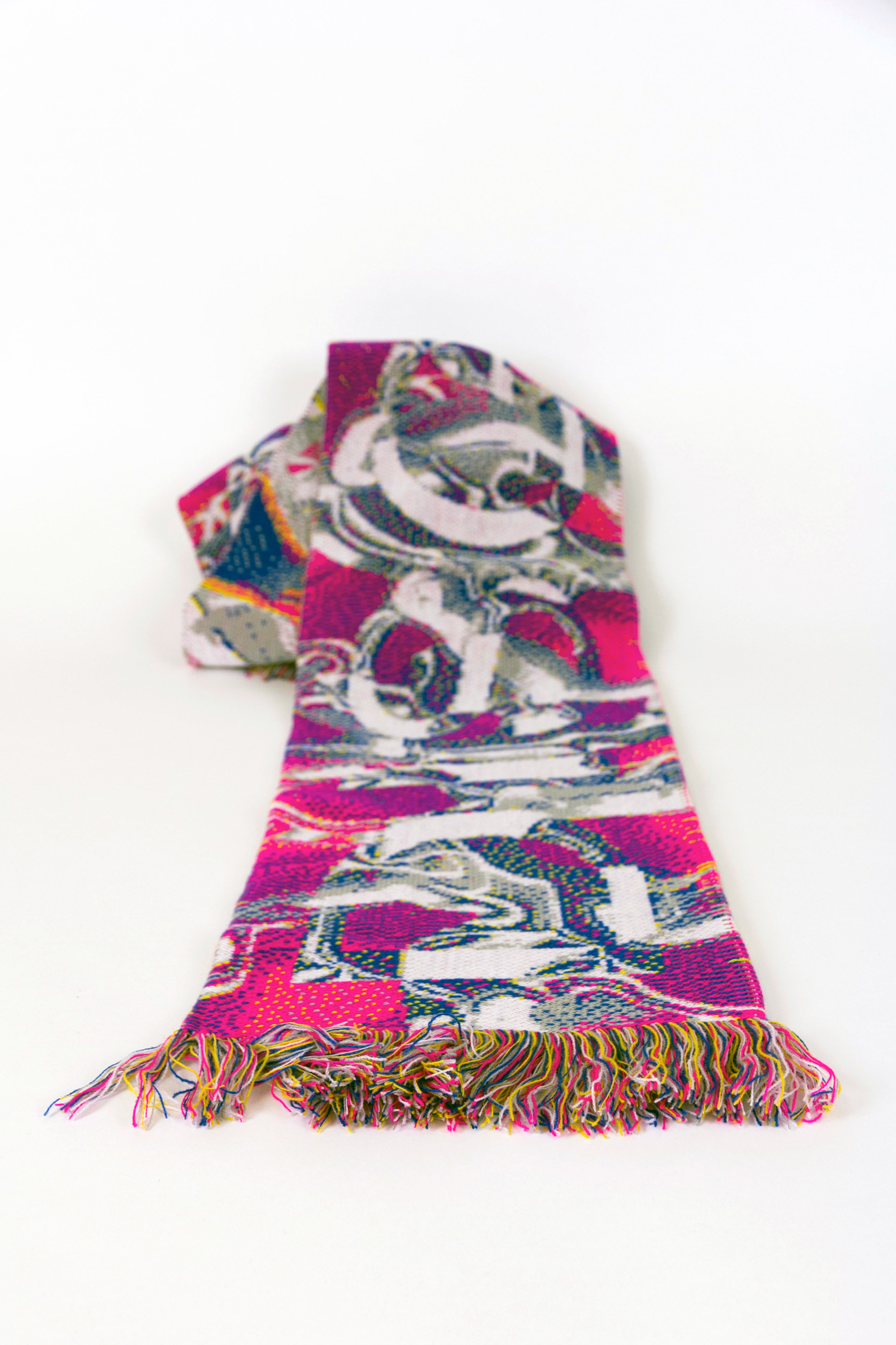
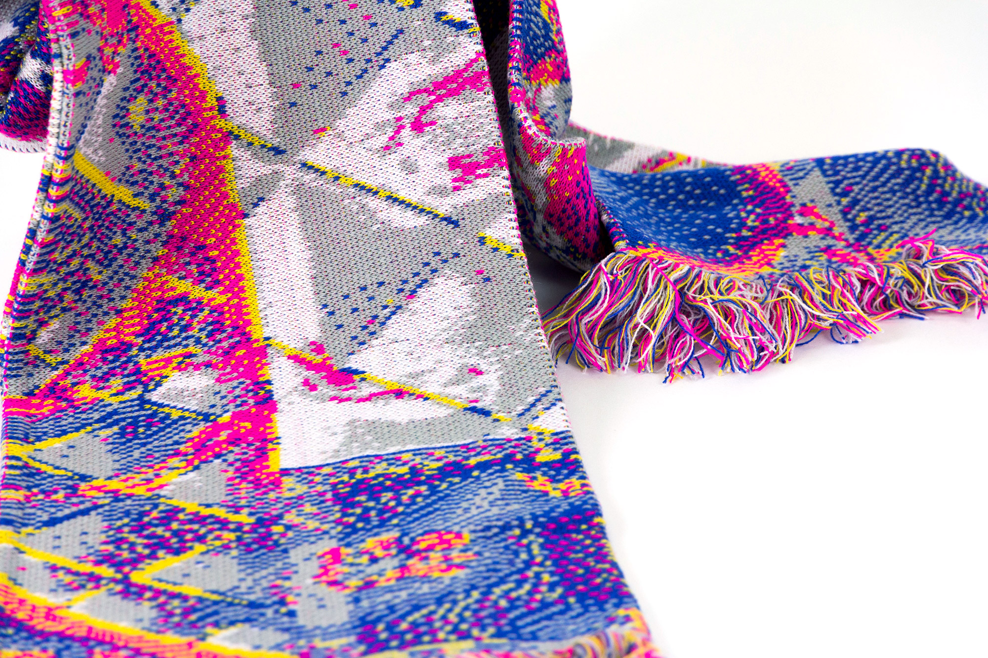
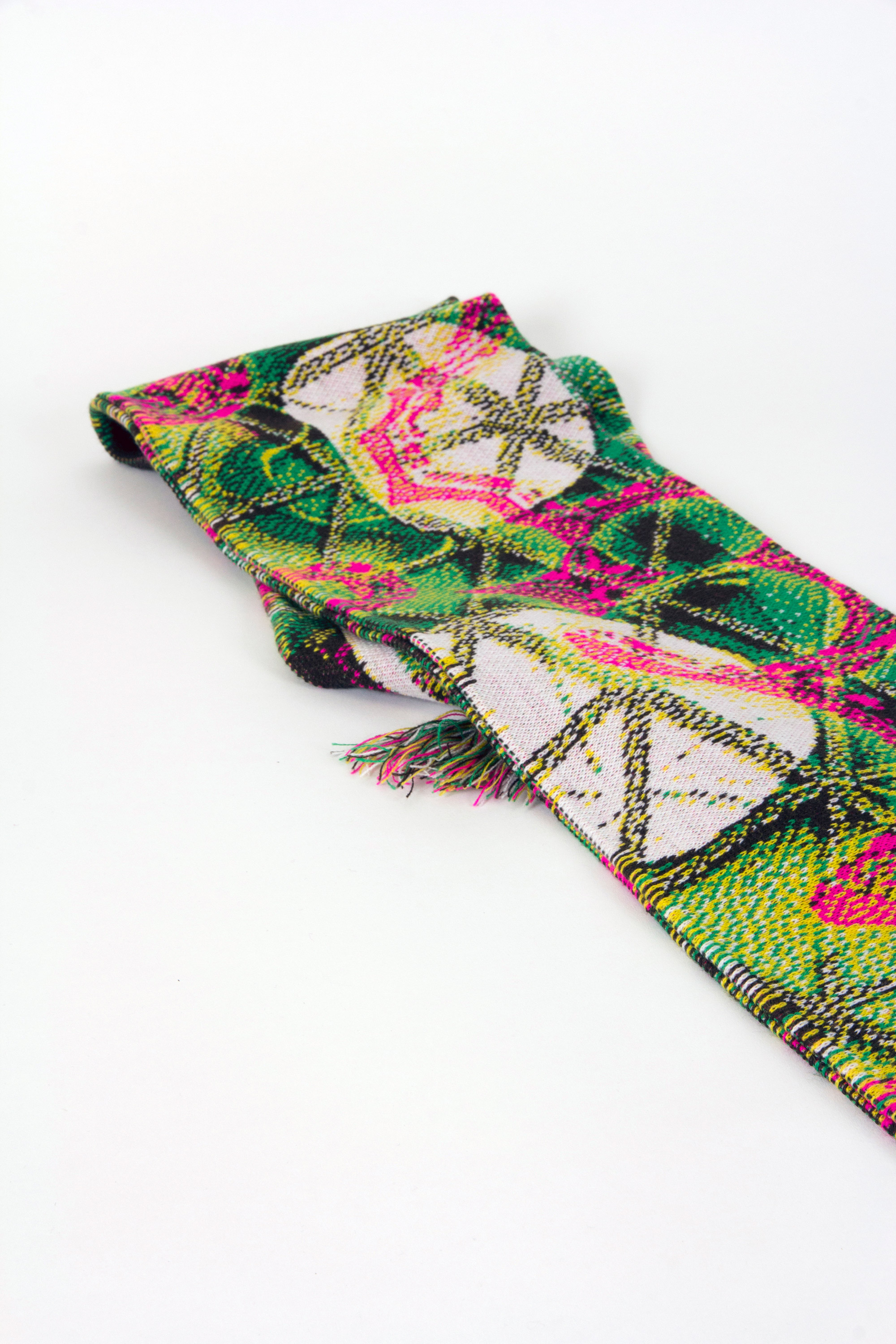
Covers proposes a new way of disseminating architectural communication through the design of a collection of scarves.
The project speculates with the format as a vessel for foregrounding the role of architectural façades into new audiences, using abstact representation and textual syntheses of their qualitative features. The intention is to establish new conceptual bridges between different cultural contexts that facilitate the expanding notion of publication.
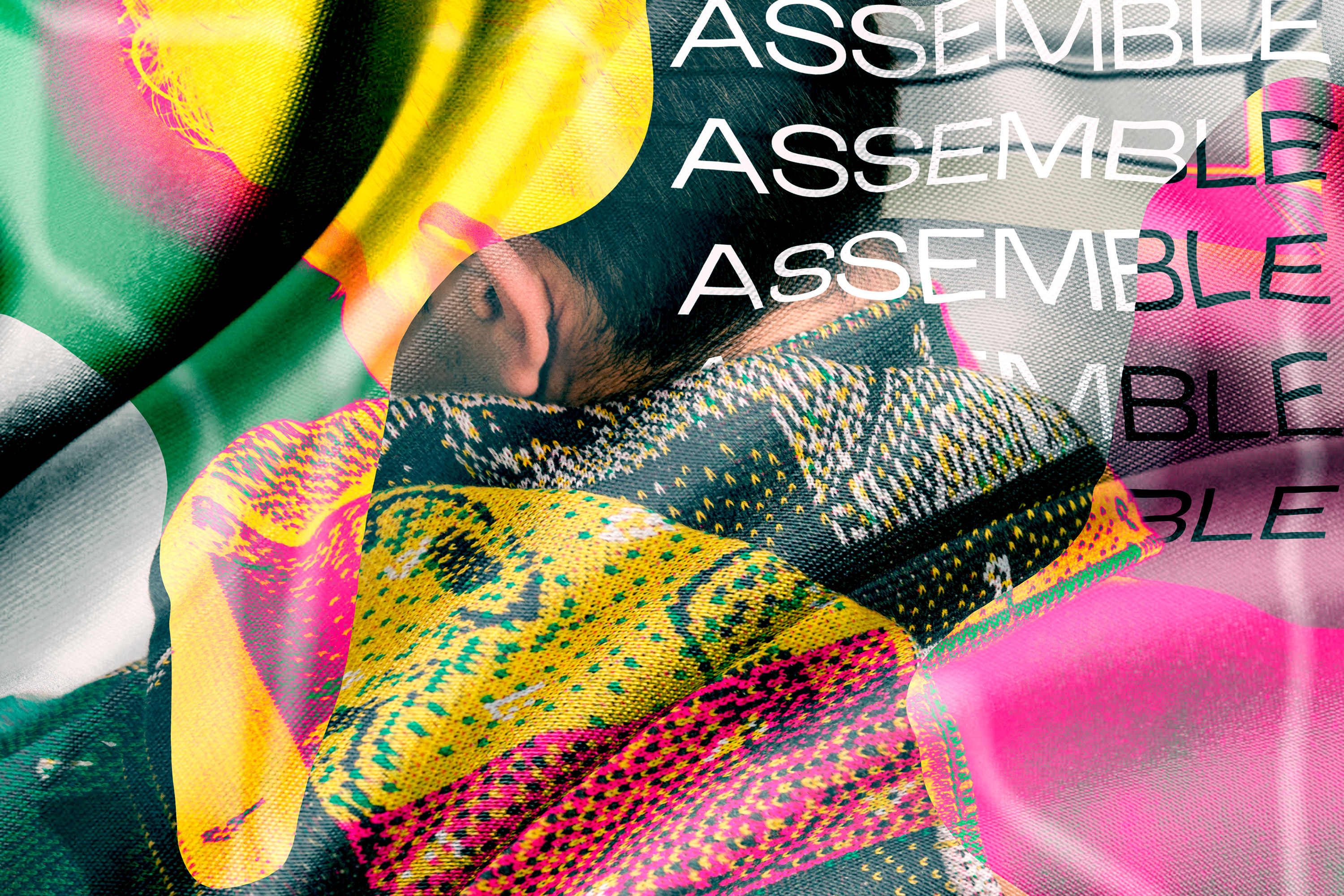
Image in collaboration with Vincent Urbani
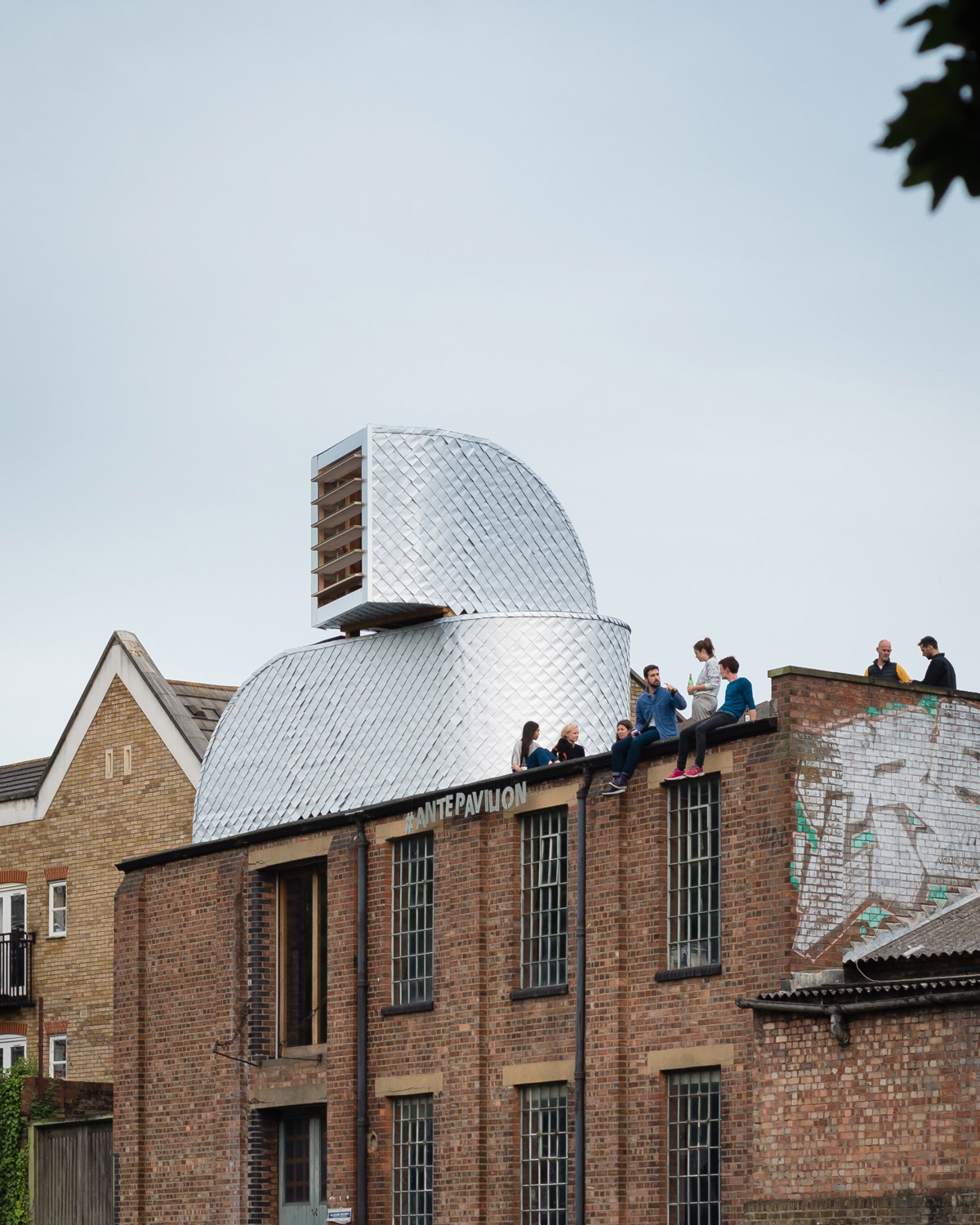
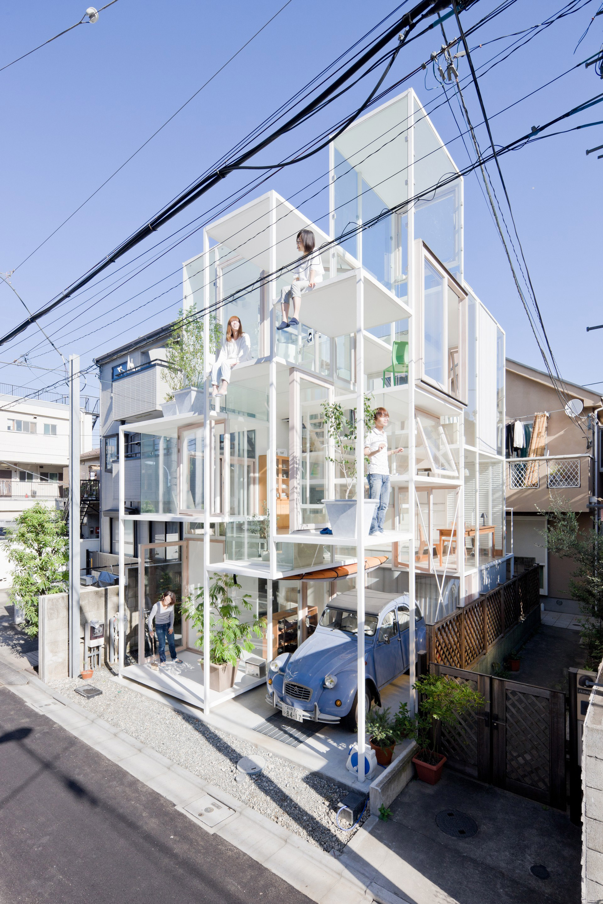
INCLUDE: Vector Architects – Captain’s House
INCLUDE: Vector Architects – Captain’s House
NOMADIC LIGHTNESS
Review of COVERS by Mariana Sameiro
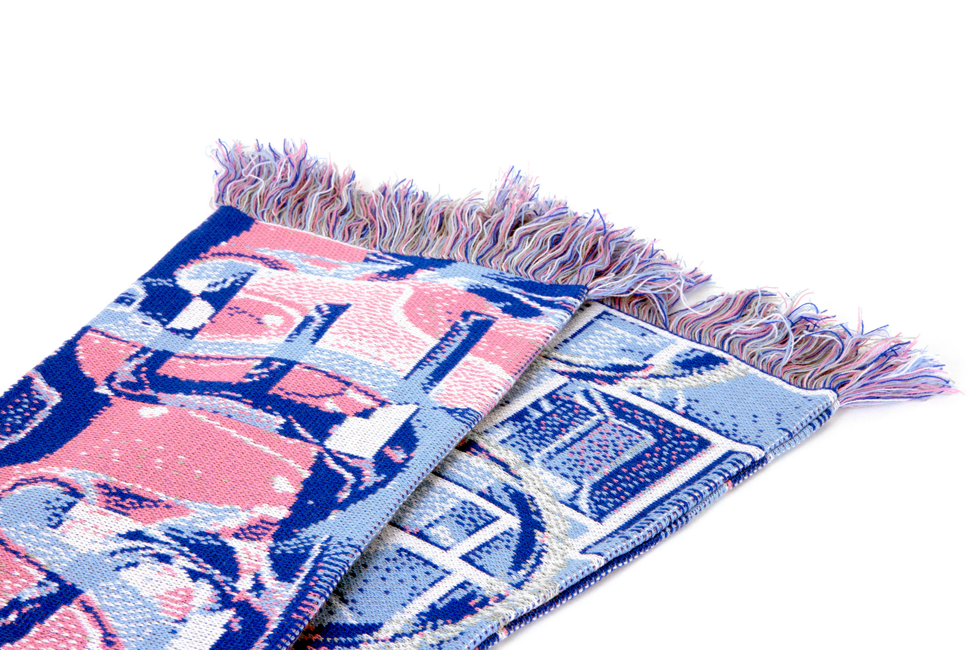
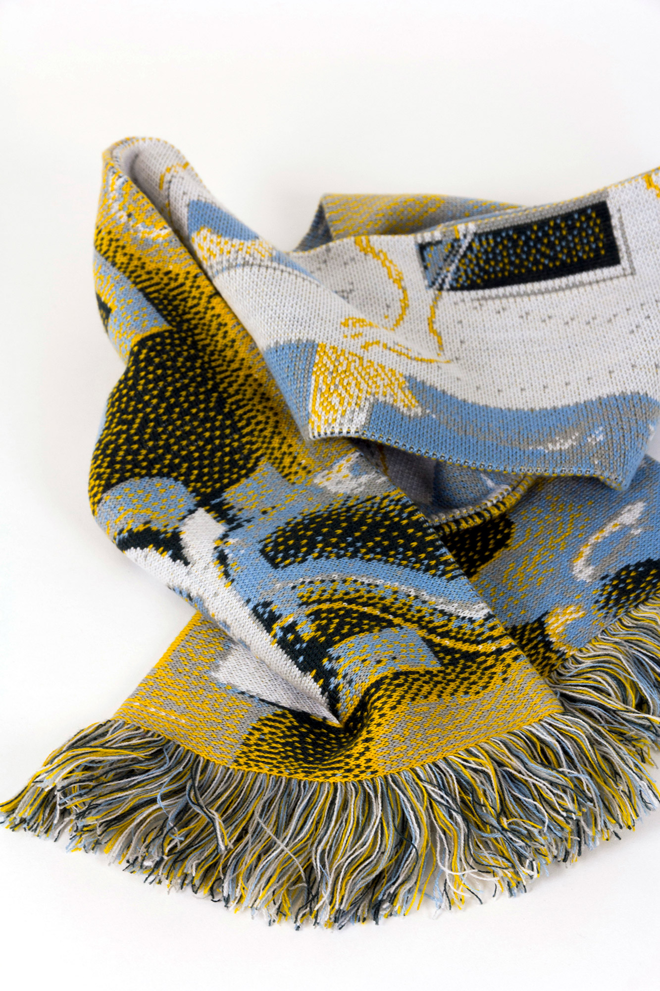
Inspired by façades, structures and the architectural space, Carlos Romo created a collection of five scarves digitally printed in five colours. Each scarf represents a different façade of a building and its unique characteristics, responding to the dominant forms of the urban space. The characteristics are encrypted by type, hidden by geometrical repetition and merged with the knitted pattern. They are elusive to five different buildings and five functions of the façade, functions defined by the author and designer. These functionalities are: disguise, enclose, expose, reveal, include, and assemble.
It is a succinct and extremely summarised discourse, composed of the use of five words recalling some of the architectural categories present by Peter Zumthor in Atmospheres.
From light yellow to neon pink, from baby blue to burgundy, from Pup Architects to Fujimoto, from warm to cold, from lightness to weight, or from interior to exterior; the collection of scarves is a constant narrative on architectural contrasts. A knitted conversation on the function of the façade, comparing its qualities, dismantling and making them distinct from each other.
The collection of scarves also subtly alludes to “Lightness”, the first chapter of Six Memos For The Next Millennium by Italo Calvino. Calvino presents the world we live in as an opaque and inert atmosphere, he compares it to a stone. Lightness is presented as a reaction to the weight of living, it is a reflection to prevent the weight of matter and solidity of the world of petrifying us. Calvino presents a world where weight is removed from structures, images and language. Lightness, in a broader sense, is a way of looking into the world but also a communicative power. It is a quality that can be adopted by the arts, new media but also architecture, in the way the building is designed, the preference given to certain materials or how light and shadows build up space.
The words chosen depict qualities of the façade establishing a visually charming analogy between the building, its decorative elements and the human body and the accessories we usually wear. The human body here becomes a medium to disseminate a message. The message becomes wearable and nomadic. It can be read anywhere at any time, but the author will never have control over these parameters. When thinking about the surface or medium, it is also interesting to mention that the production of the scarves was made possible due to the democratisation of on-demand printing online services. This means that the same concept can be applied to a number of different surfaces and objects depending on the intention, meaning and longevity of the published content.
Blending design, architecture and the use of print on textiles in one medium, “Covers” was a way to create work that questioned the relationship between architecture and design publishing. It is clearly used as a medium to publish content either visual or written. At the moment, the visuals are still empowering, the content is hidden behind the form, colour, and textures. It is left to the reader/user interpretation, and it is still dependent on an exterior explanation and context. However as long as the message is perceived and absent of an exterior and self-explanatory description, there is definitely an opportunity for expanding architectural publishing through the use of garments and their relation to the published content.
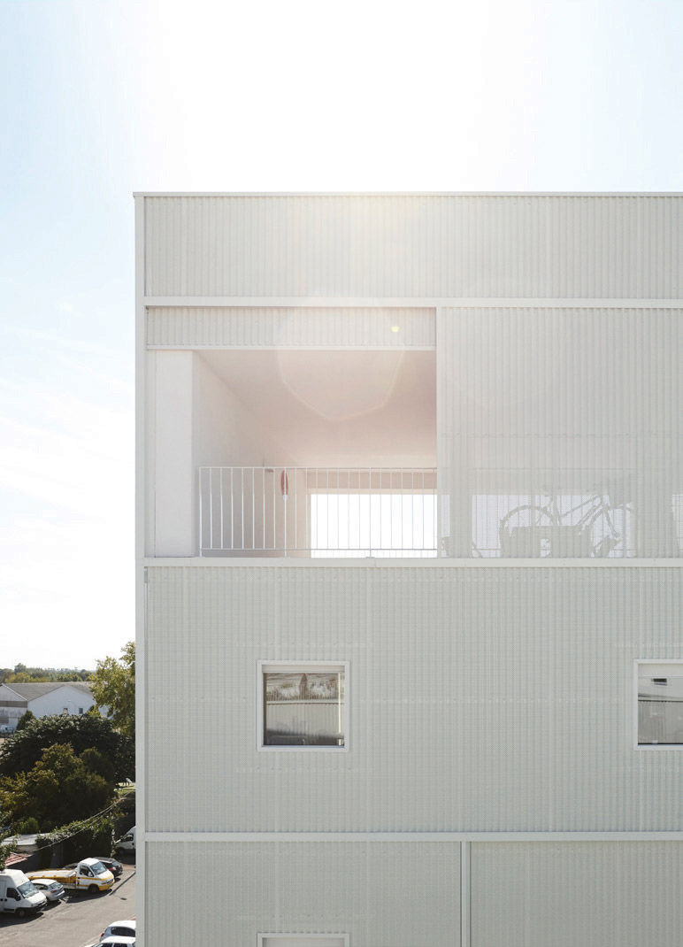
DISGUISE: PUP Architects – H-VAC Pavilion
DISGUISE: PUP Architects – H-VAC Pavilion
MATERIAL TRANSLATION
‘Covers’ makes an analogy between how façades cover a building and the way garments do it on the human body. The translation from the volumetric into the graphic synthesizes how façades work in different building examples.
ENCLOSE: Hannah Heringer – Baoxi Bamboo Hostel
EXPOSE: Sou Fujimoto – Na House
The selected architectures portray a diversity
in the functioning of façades, such as the definition
of inside-outside, the display of daily life, the
definition of gradients of privacy, the assimilation
of the historical context or as a critical surface.
REVEAL: LAN – Dwellings in Bègles
Other Works

test sliderProject type
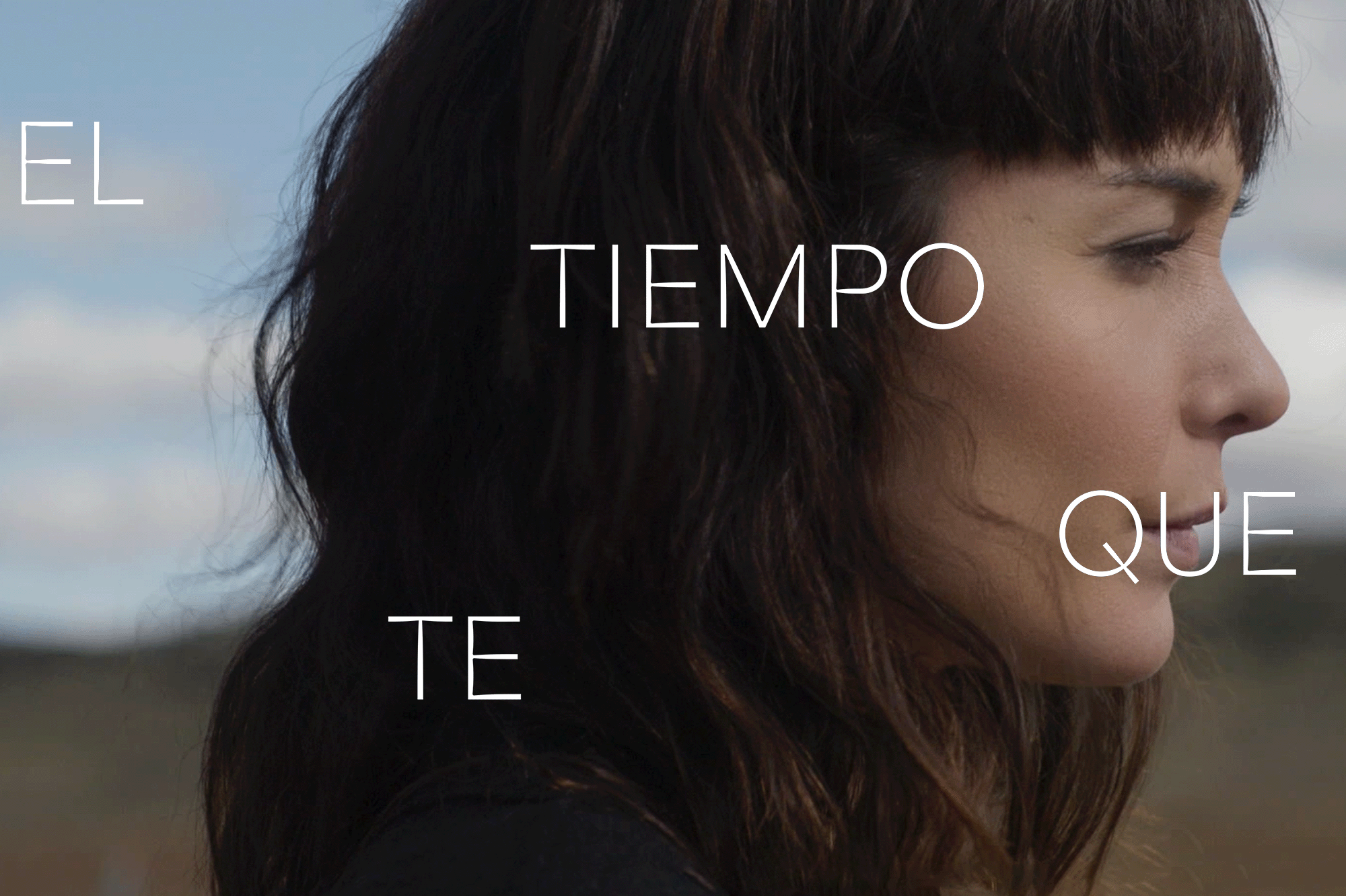
The Time it TakesMotion Graphics
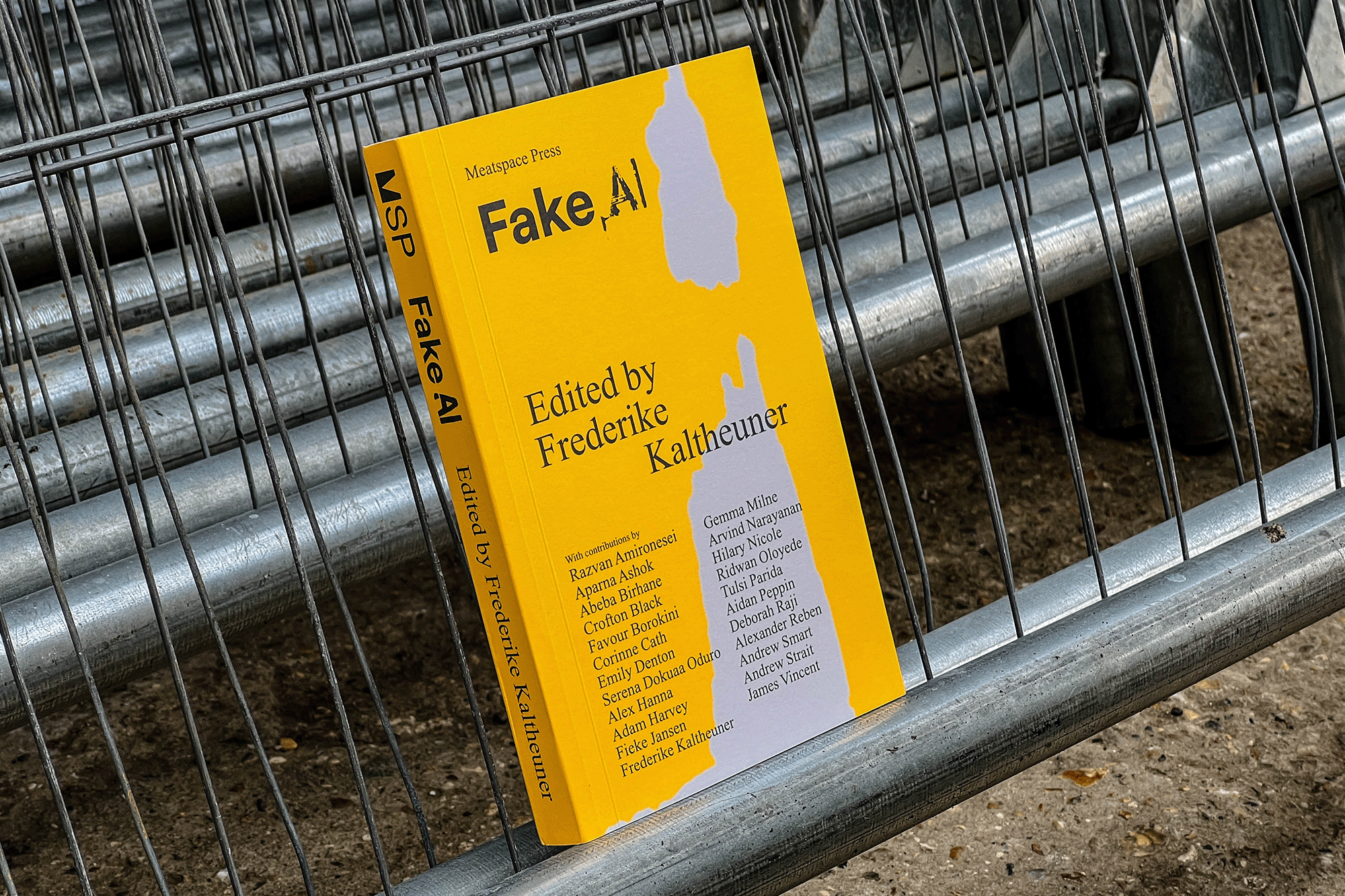
Fake AIEditorial
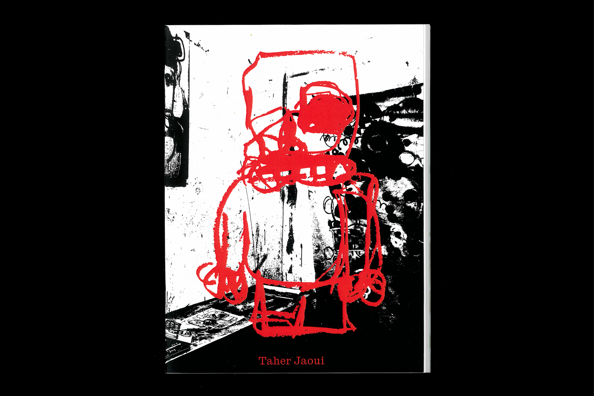
Taher Jaoui: Sketches 2022Artist Book
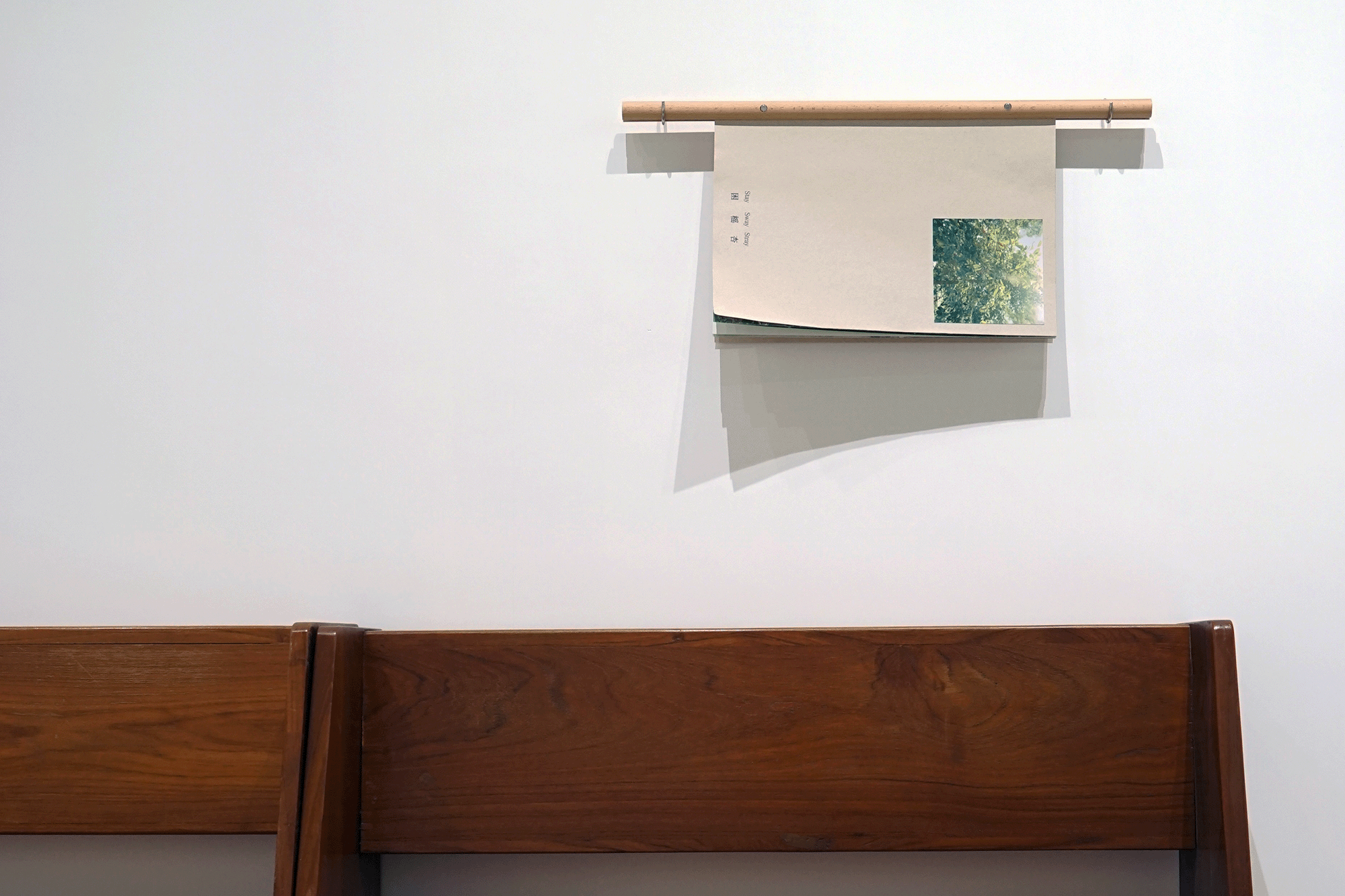
Stay/Sway/Stray (困榣杏)Artist Book
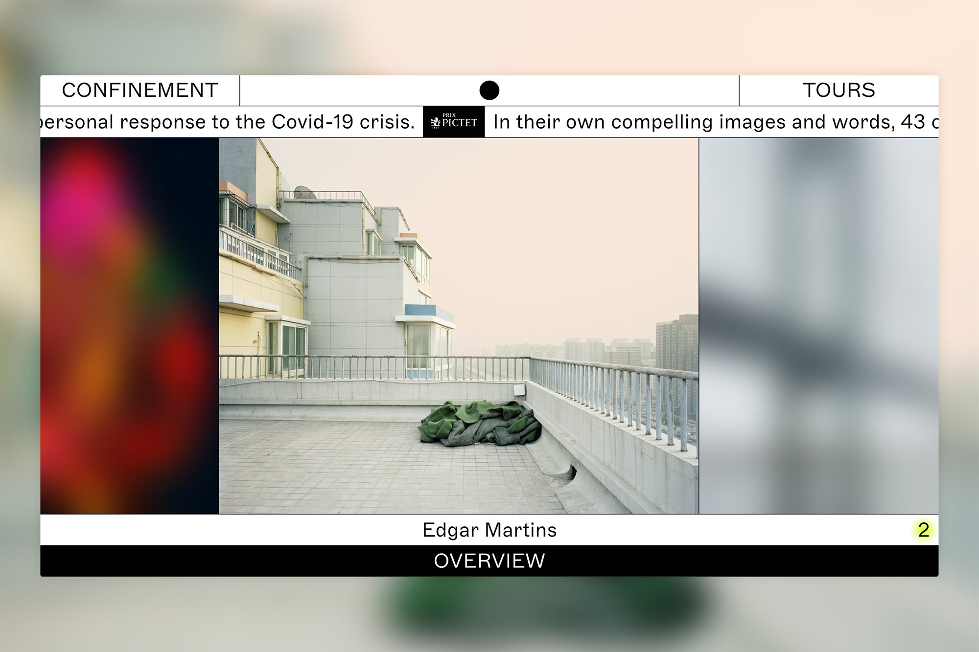
ConfinementExhibition
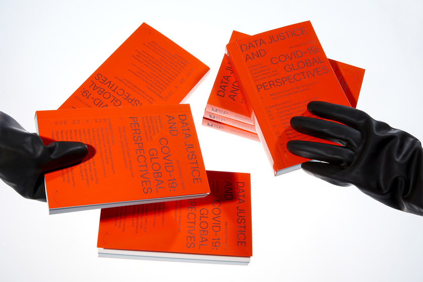
Data Justice and COVID-19Editorial
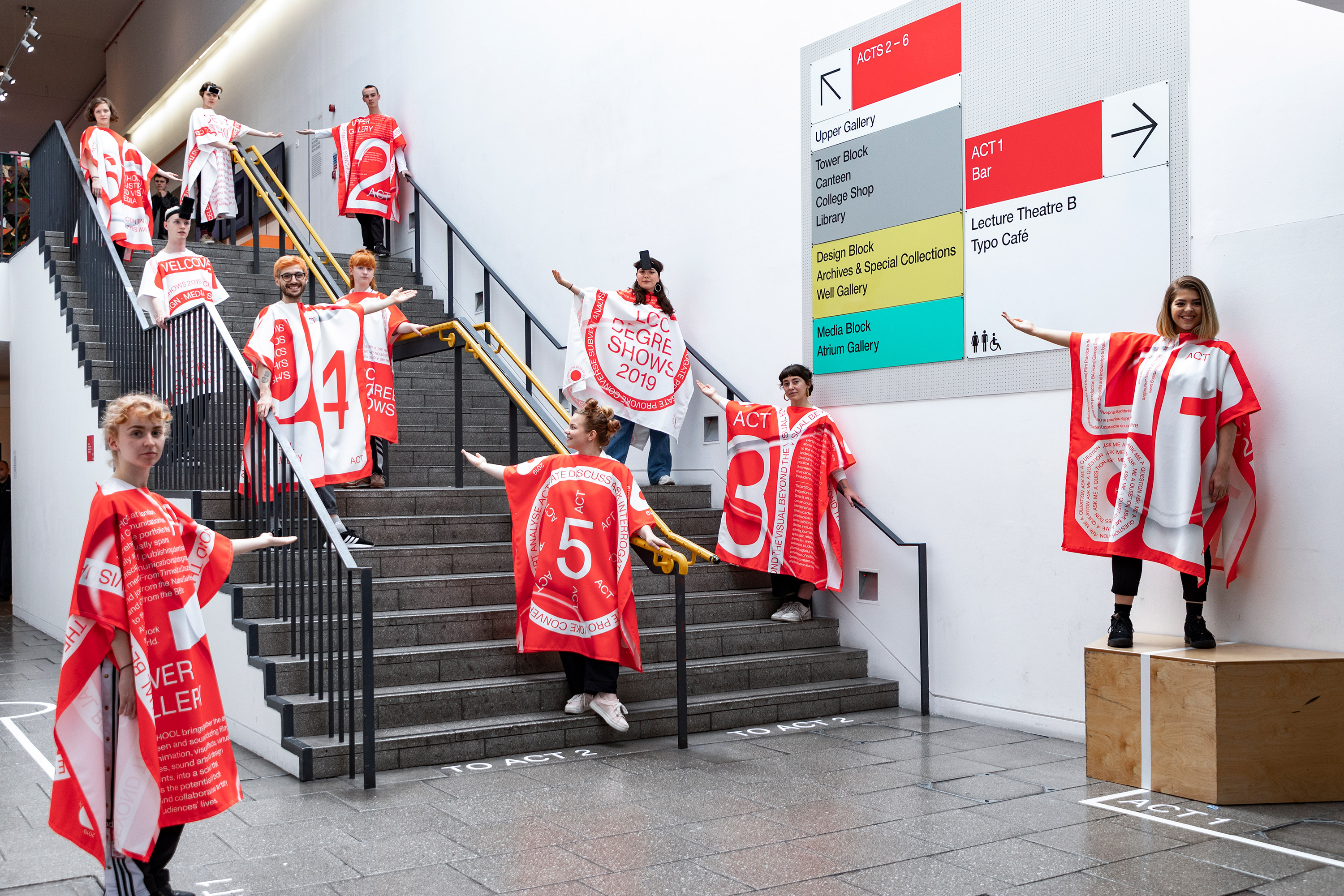
LCC Degree Shows 2019Exhibition
HTRCLAEditorial
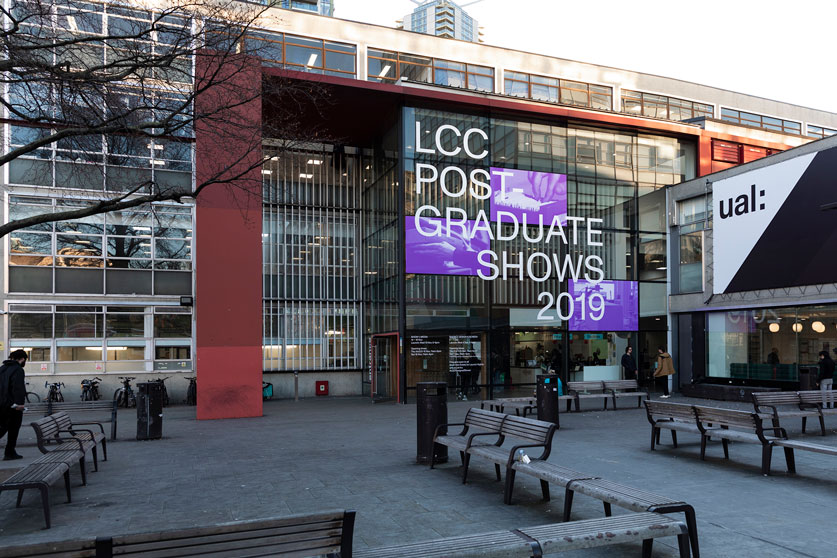
LCC Postgraduate ShowsExhibition
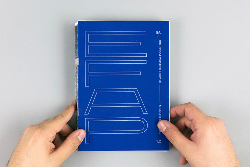
Expanding the Field of Architectural PublishingEditorial, Research
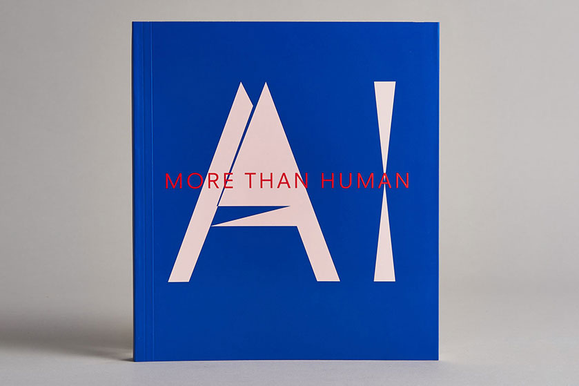
AI: More than HumanEditorial
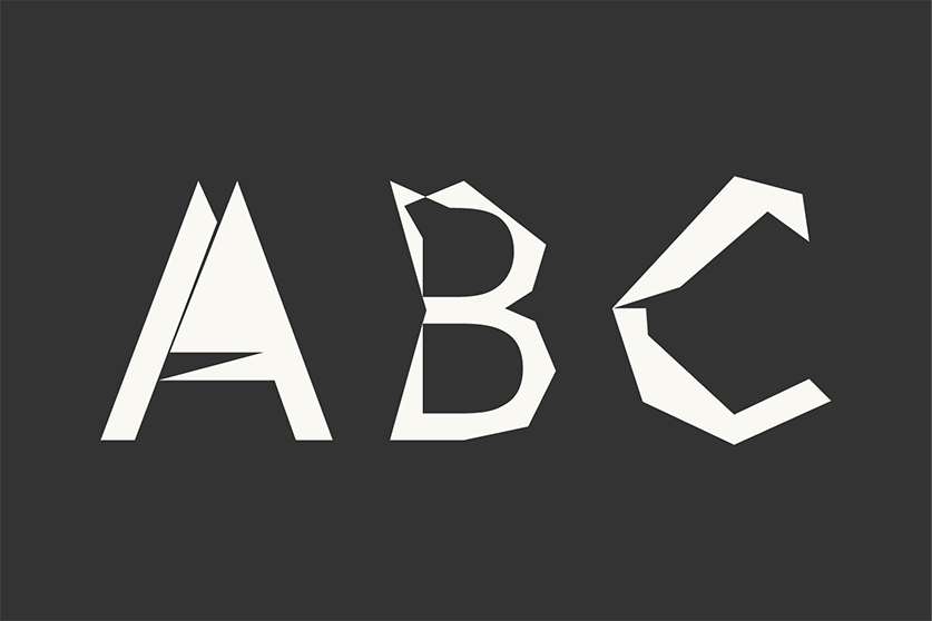
Digi Grotesk AIType
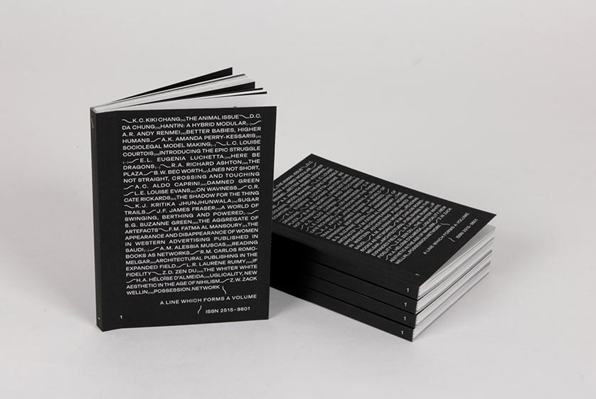
A Line which Forms a VolumeEditorial
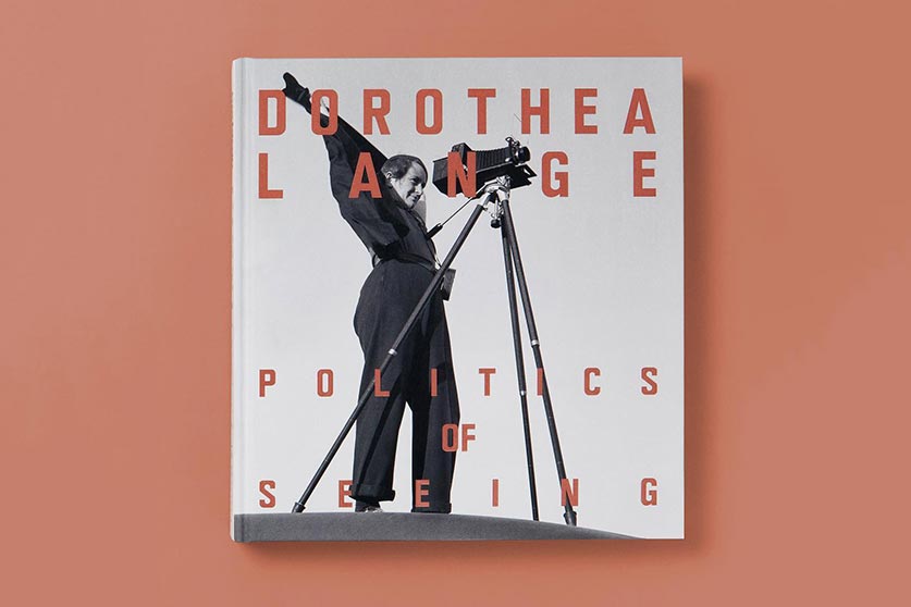
Dorothea Lange: Politics of SeeingEditorial, Exhibition
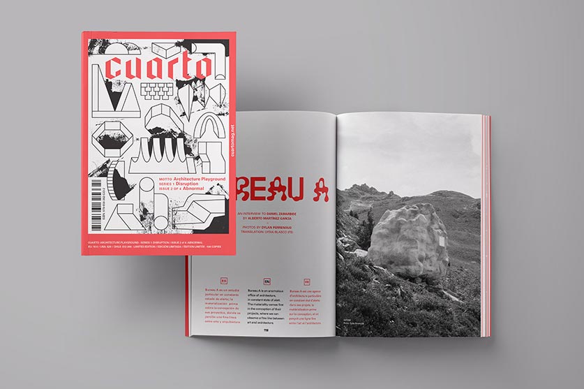
Cuarto: Architecture PlaygroundEditorial, Art Direction

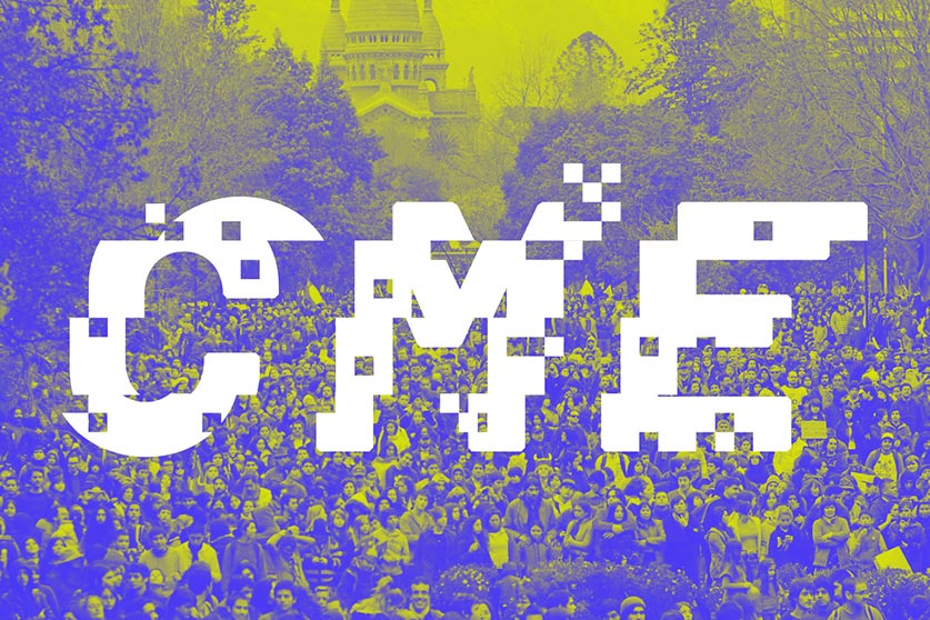
CoversEditorial, Textile
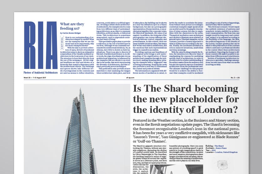
Review of Incidental ArchitectureResearch, Editorial
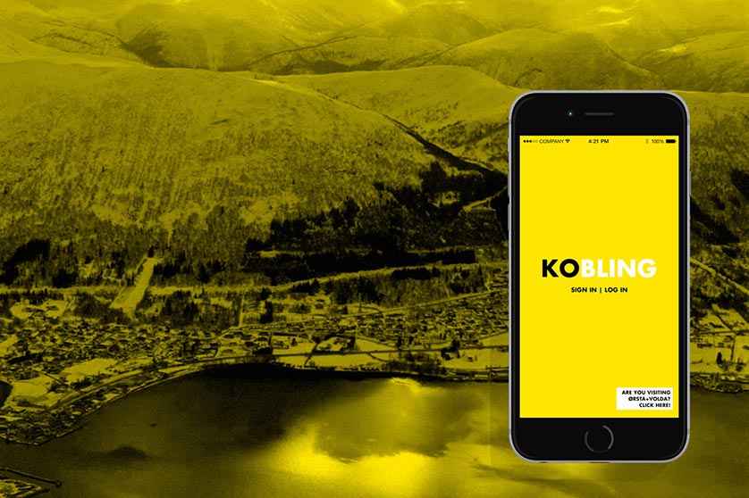
HyperkoblingResearch, Digital Design
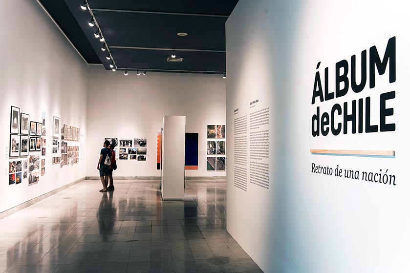
Album de ChileEditorial, Branding, Exhibition
MalamagArt Direction, Graphic Design